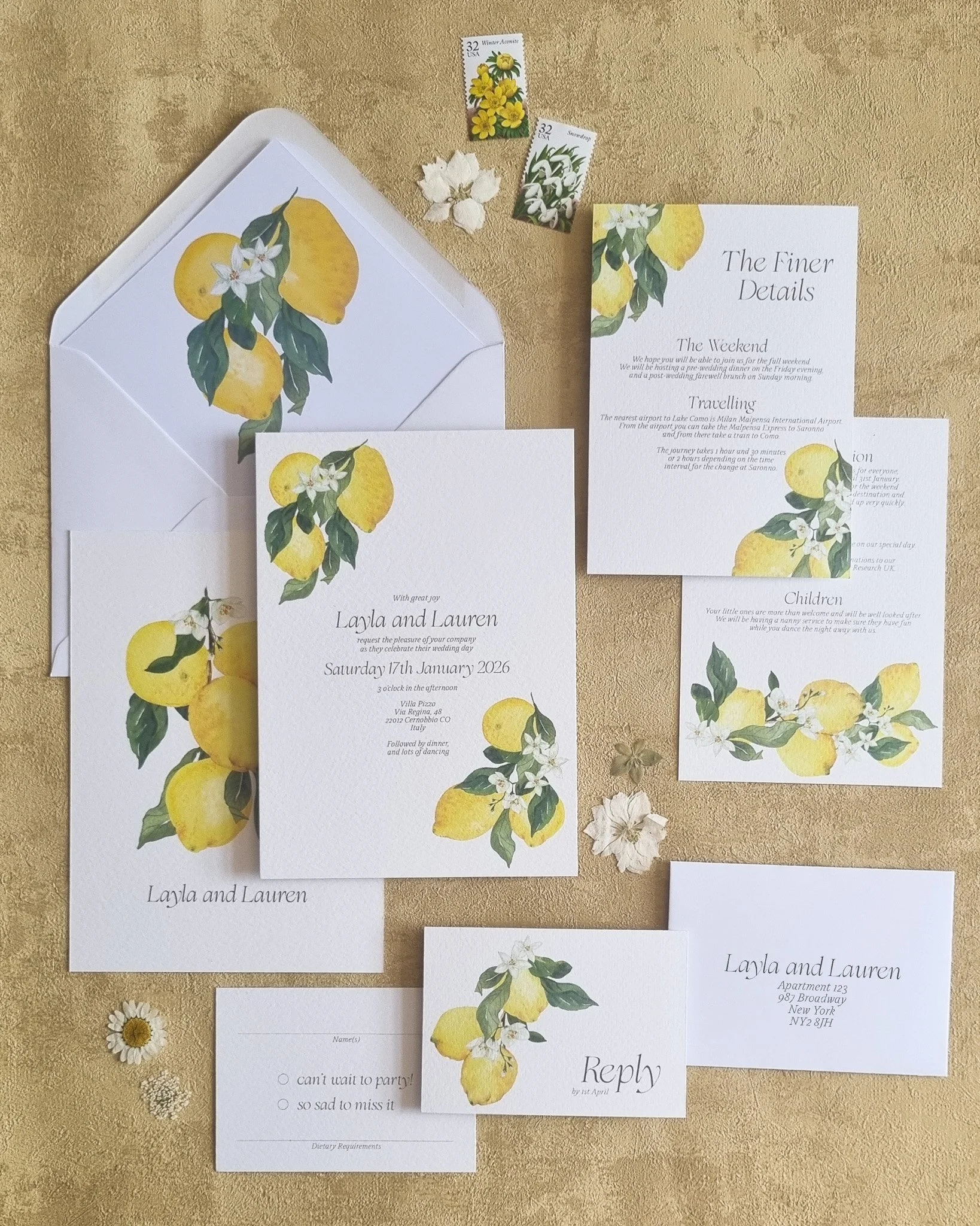
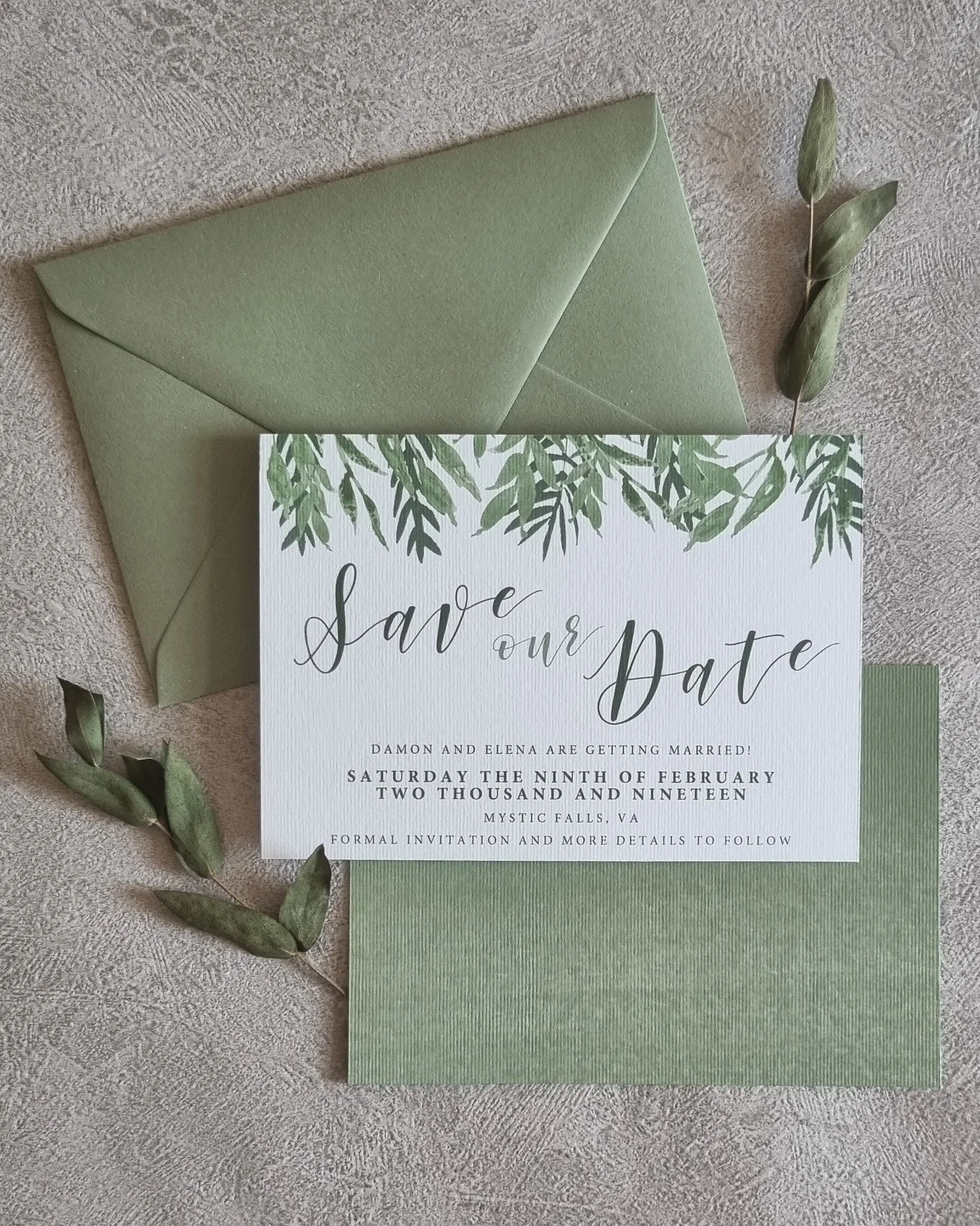
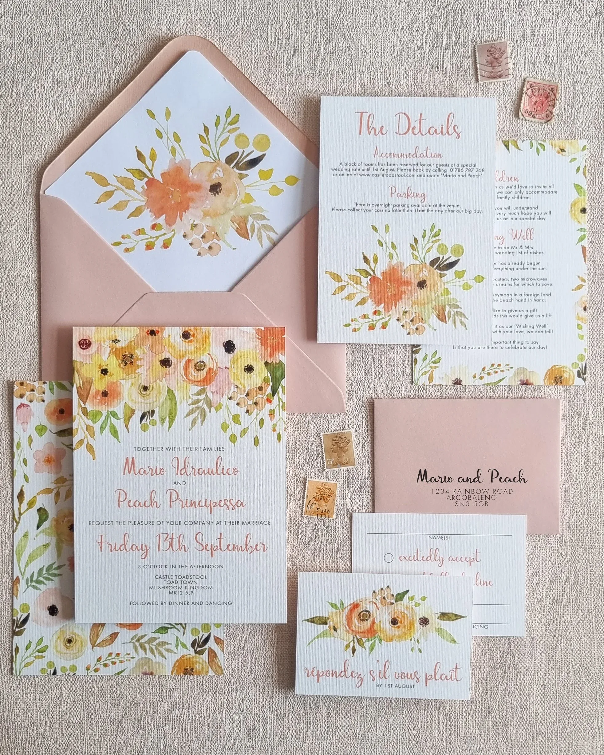
Florals for spring? Groundbreaking. If you fancy something fresher than the usual delicate blooms, this one is for you. I walk you through bright Lemon Grove citrus, lush Olive Branch greenery, playful Blush Confetti, soft watercolour Coral Splash, and a whimsical Wildflower Meadow for those still flying the floral flag. Plus a peek at how a bespoke design can capture your venue, your florals, and all the magic of your spring day.
Bespoke or semi-custom? It’s the first big stationery decision, so let me help you choose. I explain exactly what sets the two apart, then walk through three telltale signs it’s time to go fully bespoke: you’ve got a really specific vision, you want personal details woven in (venue illustrations, a cameo from your dog), or you’ve fallen for a Design Shop collection but want changes beyond the usual tweaks. Plus where to find your price.
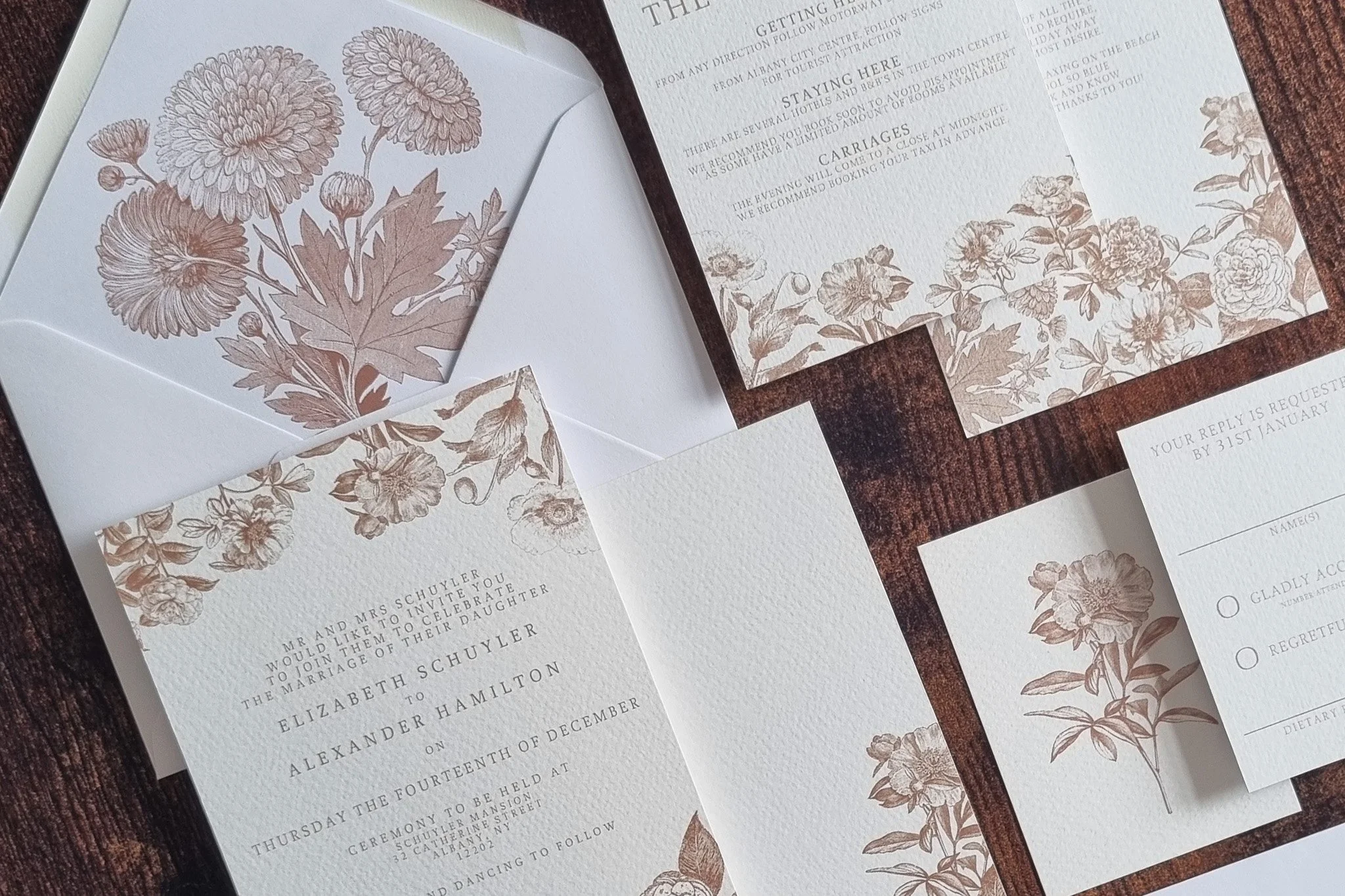
I’m all about colour, but I will happily make a case for neutrals done boldly. In this post I show you how to take a muted palette and make it anything but bland: maximalist designs in soft beige tones, monochromatic colour blocking across your suite, and a whole host of luxe finishing touches. Think real foiling, textured paper, silk ribbon, vellum wraps, wax seals and custom line illustrations for that old-money, elevated feel.
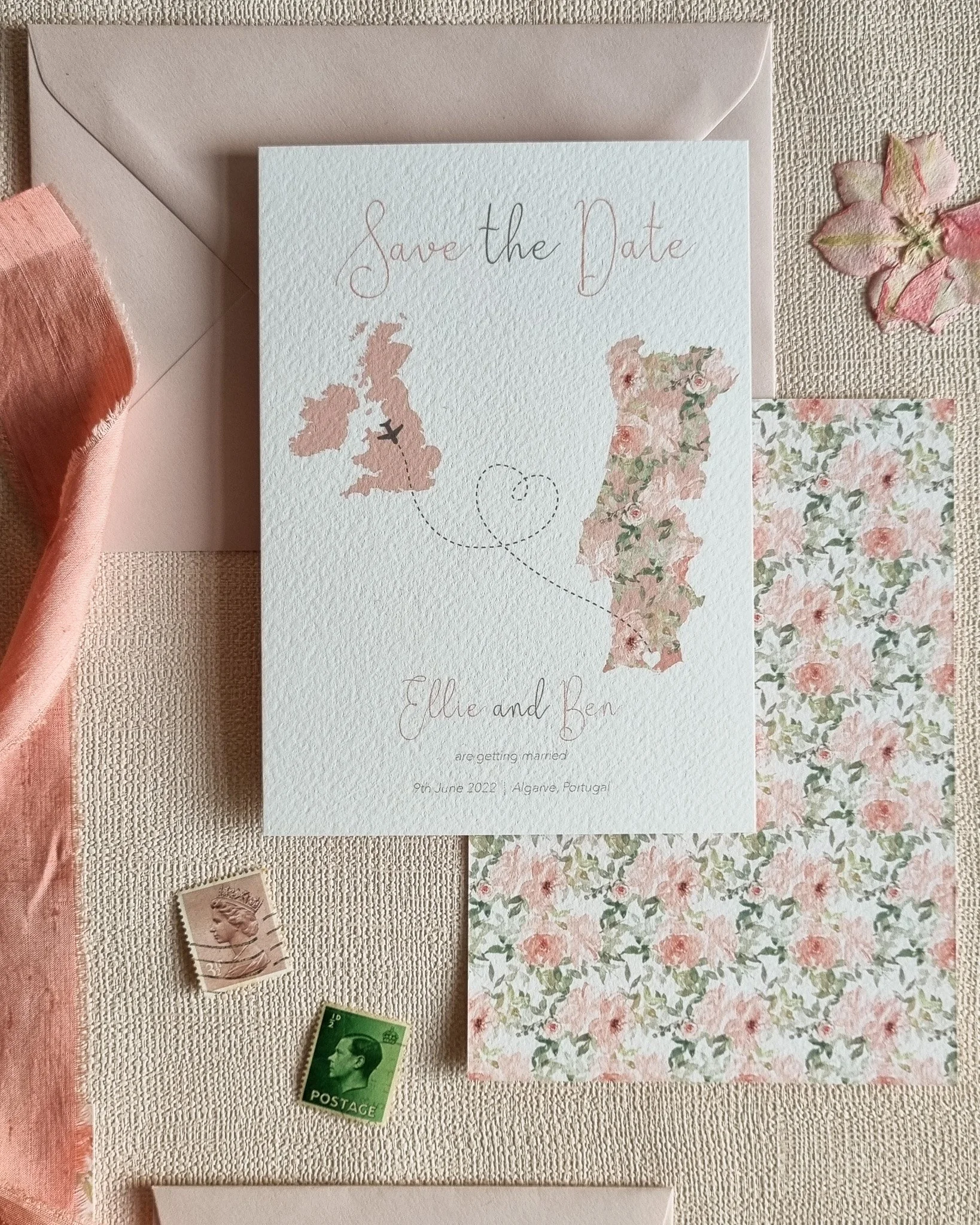
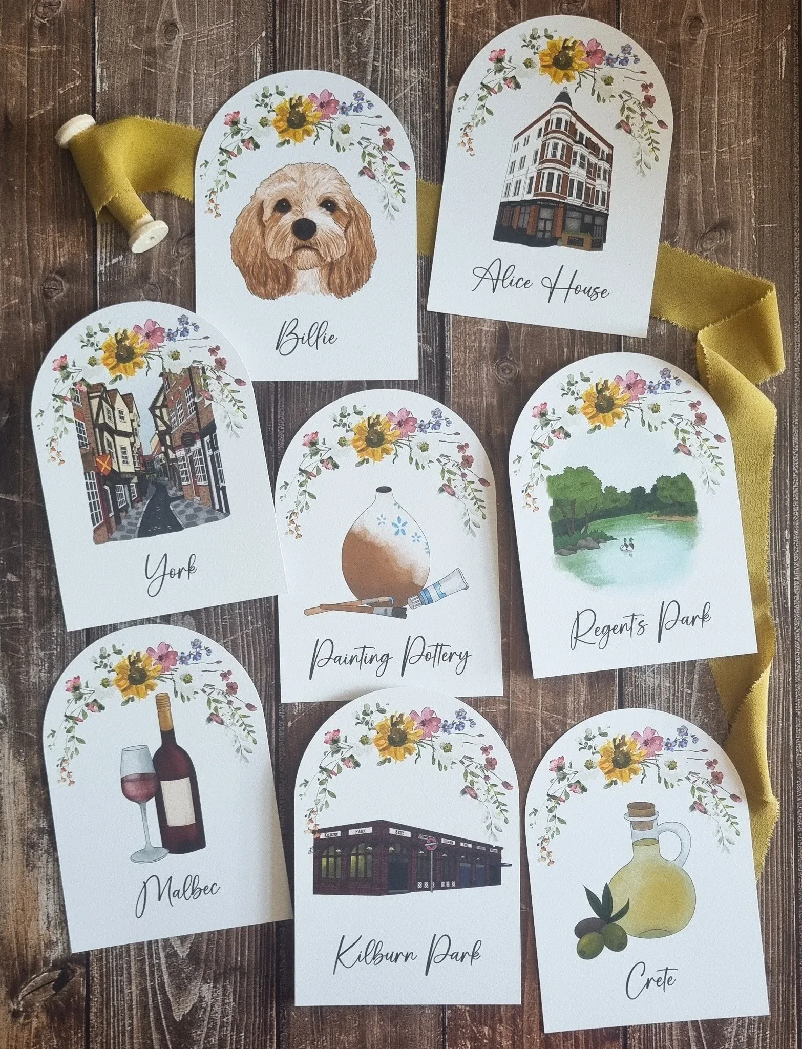
Wanderlust couples, this is your sign. Forget clichéd passports and paper planes: I share six richer ways to weave your favourite places into your stationery. There’s a real bespoke project bursting with map and monogram details, flora and fruits from special destinations, my coastal Shoreline and Mountain Pines collections, custom venue illustrations, and meaningful travel quotes. Plus ideas for naming your tables after the cities and hikes you love most.
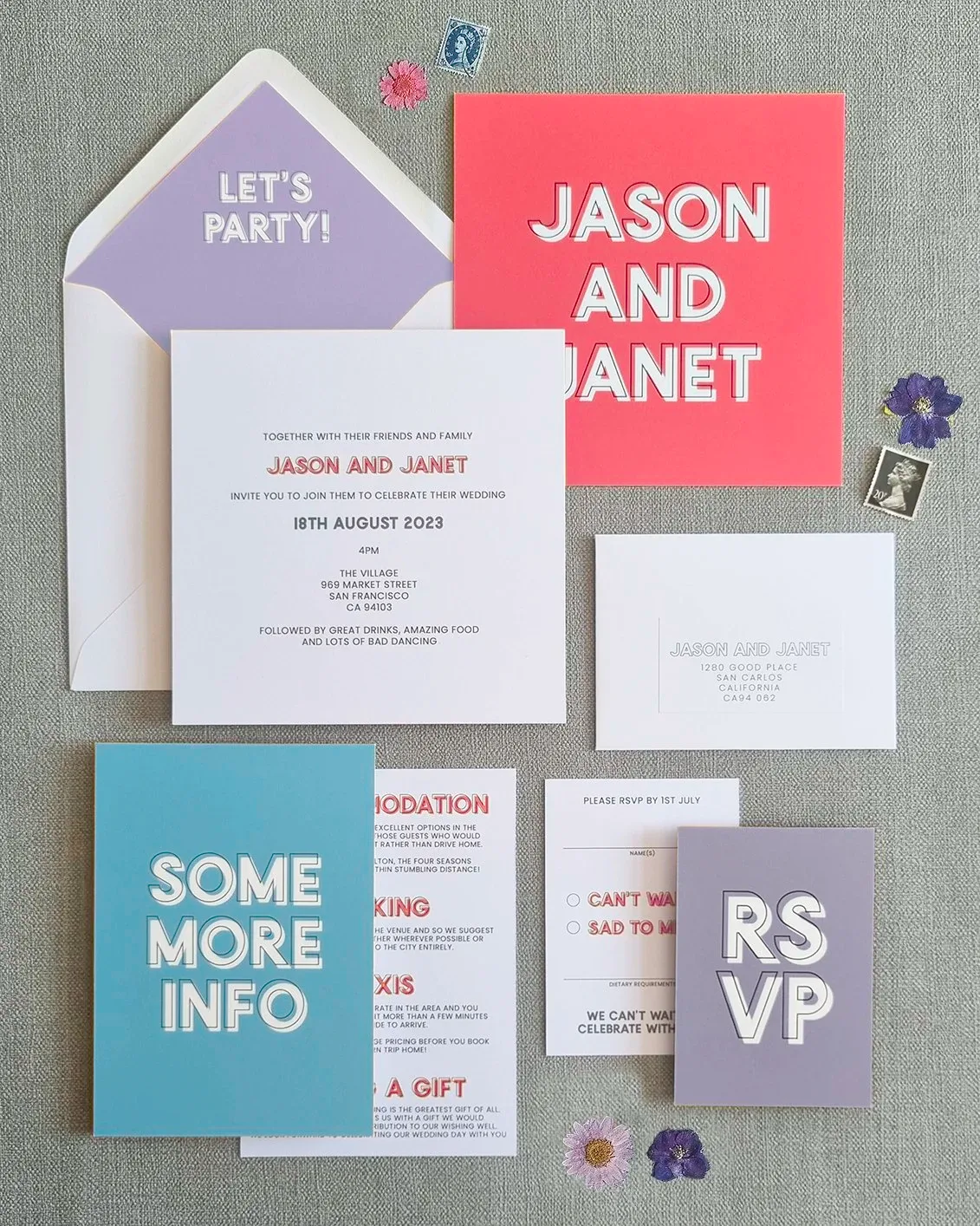
The days of traditional pastels and ivory are over, and I am here for it. This post is my love letter to colour block wedding stationery: vibrant, contrasting hues running right across your save the dates, invitations, menus, place cards and signage. I share real semi-custom makeovers, from tangerine and magenta with sage to burnt orange with aubergine and emerald, and show you how bold colour ties your whole day together beautifully.
Here’s one of the best kept secrets in the wedding world: cohesive stationery quietly makes your whole day flow. I explain how using the same colours, fonts and design elements across everything, from that first save the date to your welcome signs, table plans, menus, place cards and thank you cards, builds excitement, makes guests feel cared for, and ties your celebration together. Less overwhelm, more magic, and I’m here to handle the details.
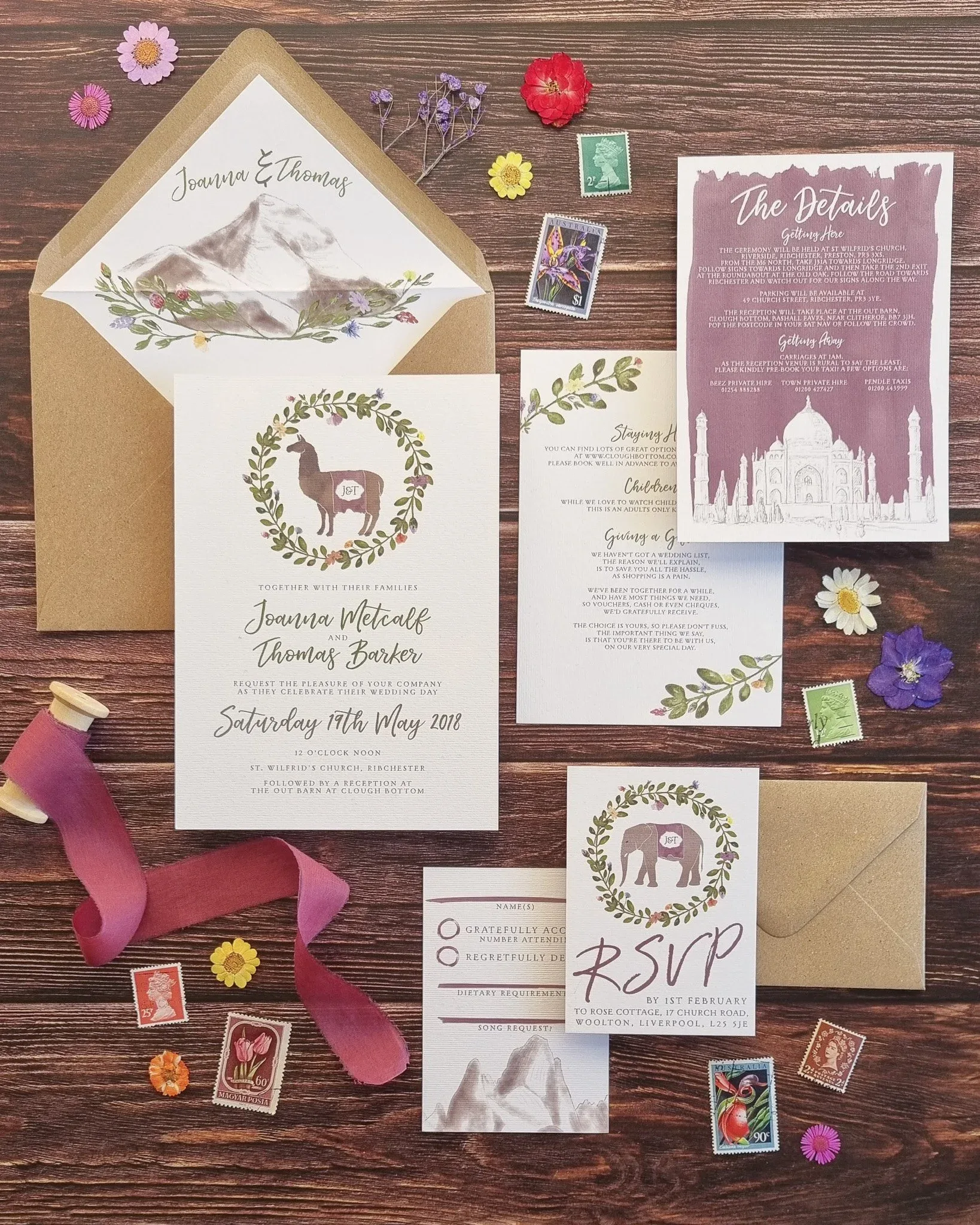
Your stationery is the first glimpse guests get of your day, so let’s make it gloriously you. In this post I share a buffet of ways to personalise it: illustrations of meaningful places and your beloved pets, elements of your heritage woven in through colours and motifs (Swedish dala horses, anyone?), a bespoke monogram that works like your wedding logo, and meaningful quotes or song lyrics. Little touches, threaded throughout, that turn paper into a keepsake.
Each season has its own colour palette, mood and magic, so why not let it shape your stationery? I take you through all four: pastel tulips, daffodils and peonies for spring, vibrant blooms and bright watercolours for summer, warm burgundy, gold and textured kraft for autumn (my personal favourite), and deep blues, silver and a little shimmer for winter. With collection suggestions for each to spark your seasonal inspiration.