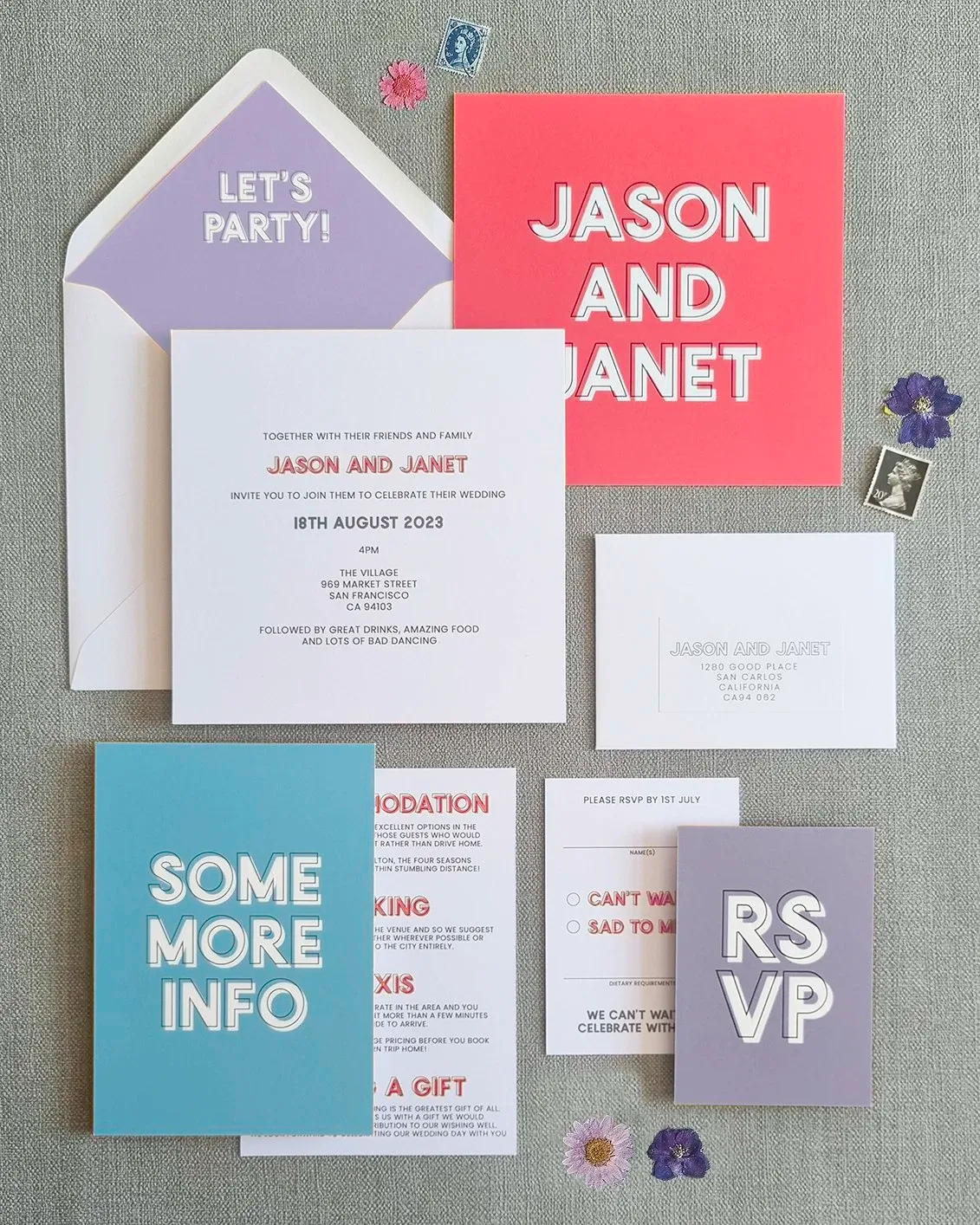
The days of traditional pastels and ivory are over, and I am here for it. This post is my love letter to colour block wedding stationery: vibrant, contrasting hues running right across your save the dates, invitations, menus, place cards and signage. I share real semi-custom makeovers, from tangerine and magenta with sage to burnt orange with aubergine and emerald, and show you how bold colour ties your whole day together beautifully.
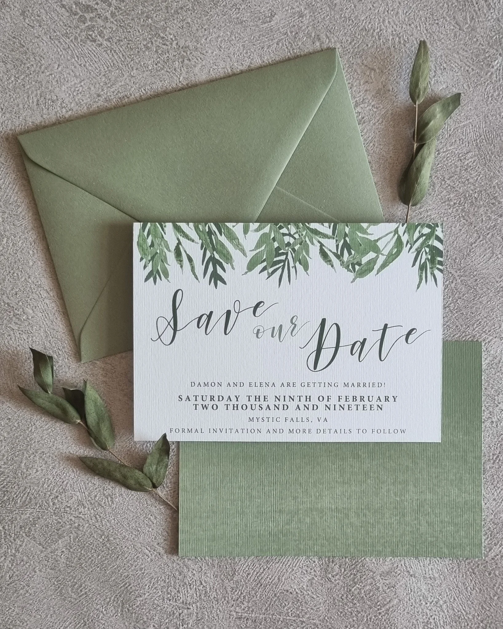
Here’s one of the best kept secrets in the wedding world: cohesive stationery quietly makes your whole day flow. I explain how using the same colours, fonts and design elements across everything, from that first save the date to your welcome signs, table plans, menus, place cards and thank you cards, builds excitement, makes guests feel cared for, and ties your celebration together. Less overwhelm, more magic, and I’m here to handle the details.
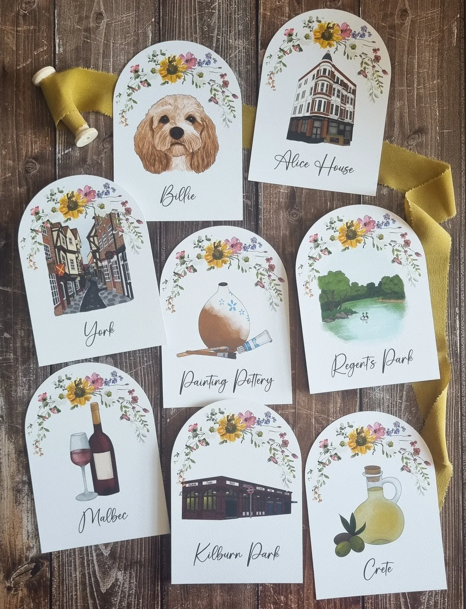
Your stationery is the first glimpse guests get of your day, so let’s make it gloriously you. In this post I share a buffet of ways to personalise it: illustrations of meaningful places and your beloved pets, elements of your heritage woven in through colours and motifs (Swedish dala horses, anyone?), a bespoke monogram that works like your wedding logo, and meaningful quotes or song lyrics. Little touches, threaded throughout, that turn paper into a keepsake.
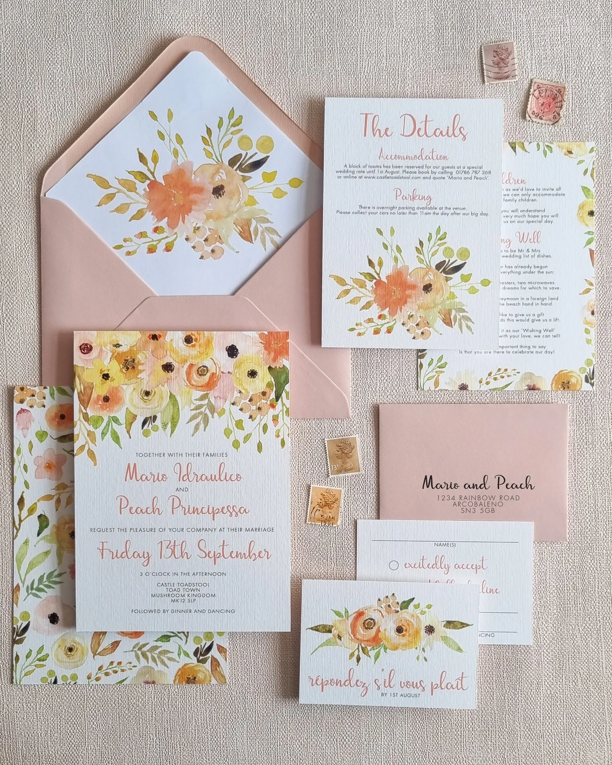
Each season has its own colour palette, mood and magic, so why not let it shape your stationery? I take you through all four: pastel tulips, daffodils and peonies for spring, vibrant blooms and bright watercolours for summer, warm burgundy, gold and textured kraft for autumn (my personal favourite), and deep blues, silver and a little shimmer for winter. With collection suggestions for each to spark your seasonal inspiration.
Feeling lost in stationery jargon? Let me walk you through it, one letter at a time. This whimsical A to Z covers everything from Authenticity, Bespoke and Cohesion to Details cards, Envelope addressing and Finishing touches, with proper practical nuggets along the way (your guest list is one per household, not one per person!), plus ordering timelines, postage tips, QR codes, vellum and table names. The plain-English glossary every couple needs.
Meet the newest member of the Hawthorne and Ivory family: personalised wedding guestbooks, and I am so proud of these. I give them the proper introduction they deserve, talking through the thoughtful details: hardback ring binding that lies flat for prosecco-buzzed guests, colour choices in black, white, silver or gold, and an optional satin ribbon tie that’s just bloody gorgeous. Each one customised with your names, date, and any extra touches you fancy.
Wedding planning can feel like sand slipping through your fingers, so let me be your stationery fairy godmother. In this post I explain exactly how a professional stationer takes one big task off your plate: expert help with timing, wording, etiquette and printing, the peace of mind that everything lands on time, and stationery that genuinely wows your guests. You brief the vision, I handle the rest, and you get your time back.
Why don’t I offer digital invitations? I get asked this a lot, so here’s my heartfelt answer. This post is a love letter to paper: the clatter at the letterbox, the textured card in your hands, the tangible connection a screen simply can’t match. I talk through how paper invitations demand attention, become cherished keepsakes, and set the tone for your day, so years on you can open that box of mementos and relive every moment.