How To Go Bolder With Neutral Stationery
The short answer: Neutral wedding stationery doesn't have to be bland. Layer in maximalist designs in muted tones (think intricate beige botanicals), play with a monochromatic colour-block across your suite (ivory invitation, sandy beige details card, deeper tan RSVP), and add luxury finishing touches like real foiling, textured paper, silk chiffon ribbon, vellum wraps and wax seals to bring depth, warmth and that old-money feel.
For anyone new here, Hawthorne and Ivory is my wedding stationery design studio. I design colourful, fun-loving save the dates, invitations, on the day pieces (menus, place cards, signage), guest books and thank you cards for UK couples, either through The Design Shop's ready-to-customise collections or fully bespoke.
If you've glanced around my website for even a moment... you might have noticed that I am allllllll about colour. But that's not to say I won't embrace a stunning neutral colour palette. At Hawthorne and Ivory, even neutrals are bolder and more maximalist. Always elevated with a little something extra…
So, let me show you how to take that to the next level, for neutral wedding stationery that is anything but bland.
Let's explore some creative ways to elevate your neutral wedding stationery and make it uniquely yours.
Neutral Wedding Stationery With a Twist
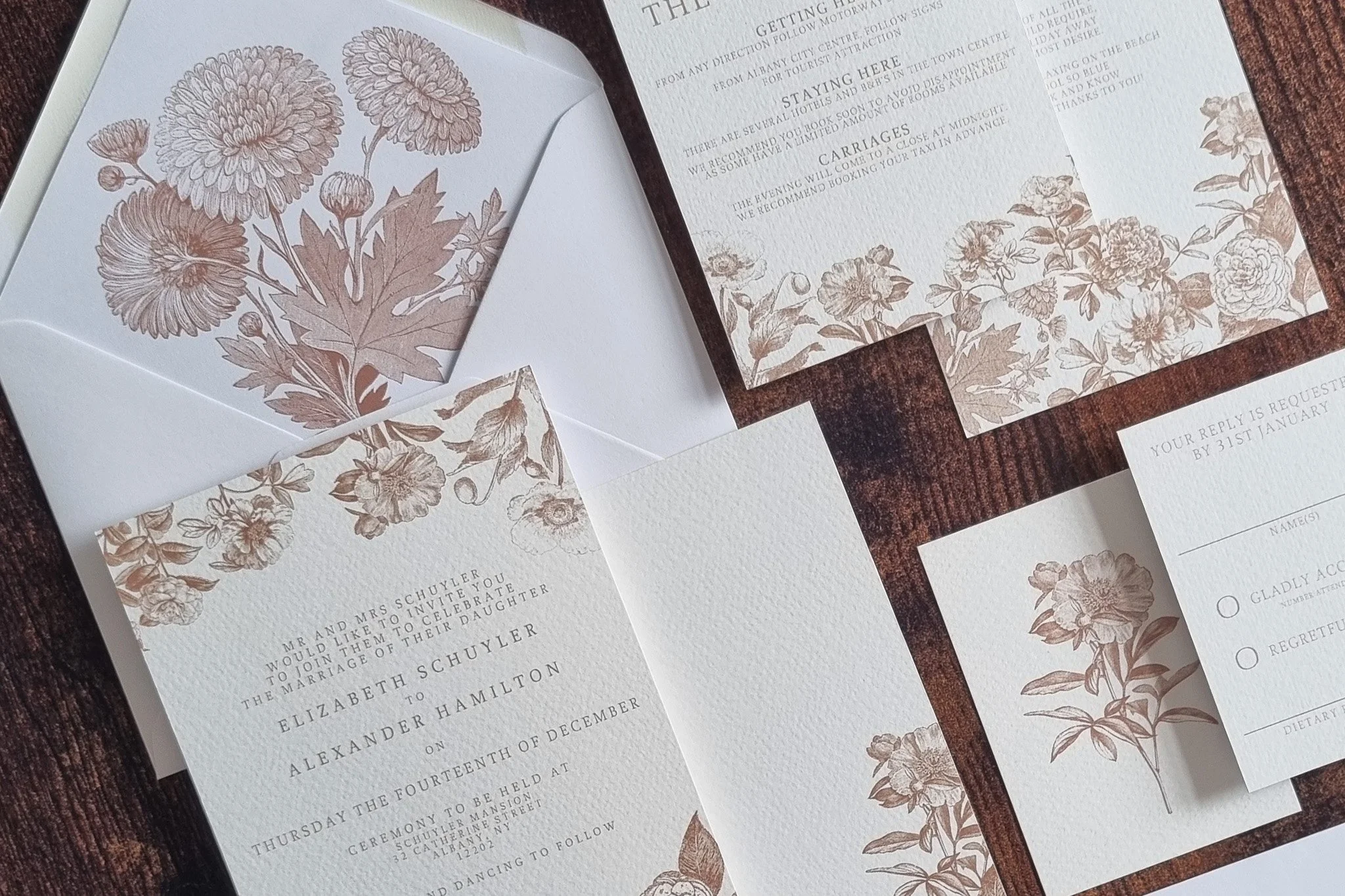
Maximalist Designs in Muted Tones
Who says maximalist designs can't be neutral? By using muted tones, you can create intricate, detailed designs that feel lush and extravagant without overpowering the eye. Think intricate botanical illustrations, delicate watercolour florals, or rustic boho touches, all rendered in soft beige tones.
These designs can reflect the opulence and grandeur of your wedding while maintaining a sense of understated elegance though the colour palette.
This approach ensures that your neutral stationery stands out and makes a statement. It's perfect for couples who want to combine the best of both worlds- subtlety and extravagance.
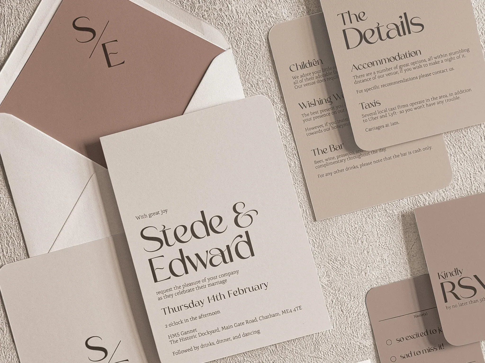
Play With The Colour Palette
Just because you're opting for a more neutral and paired back palette, doesn't mean you can't still explore. Think about playing with the idea of monochromatic colour schemes and explore colour blocking in your designs - with each element in ever so slightly different shades of the same colour.
This can work especially beautifully with soft neutrals and give a really chic feel to your invitation suite. Opt for a different shade on each element of your set... the invitation in ivory, the details card in the lightest sandy beige, and your RSVPs in a deeper tan…
This gives a real opportunity for a luxe vibe with an old-money feel and aesthetic.
Extra Luxury Touches
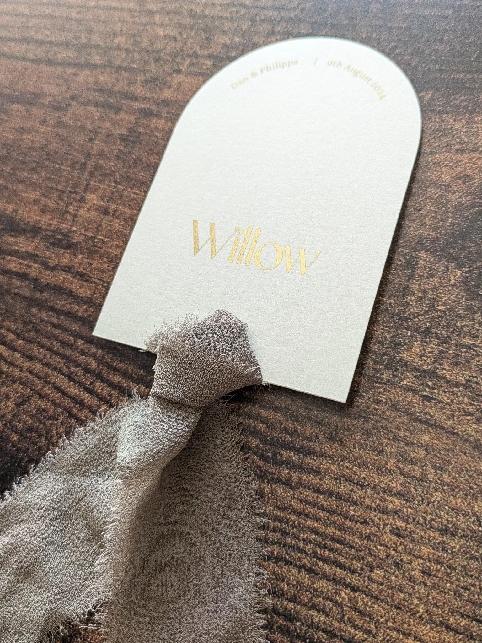
Arch cut place card with hand torn silk chiffon ribbon and gold foiling
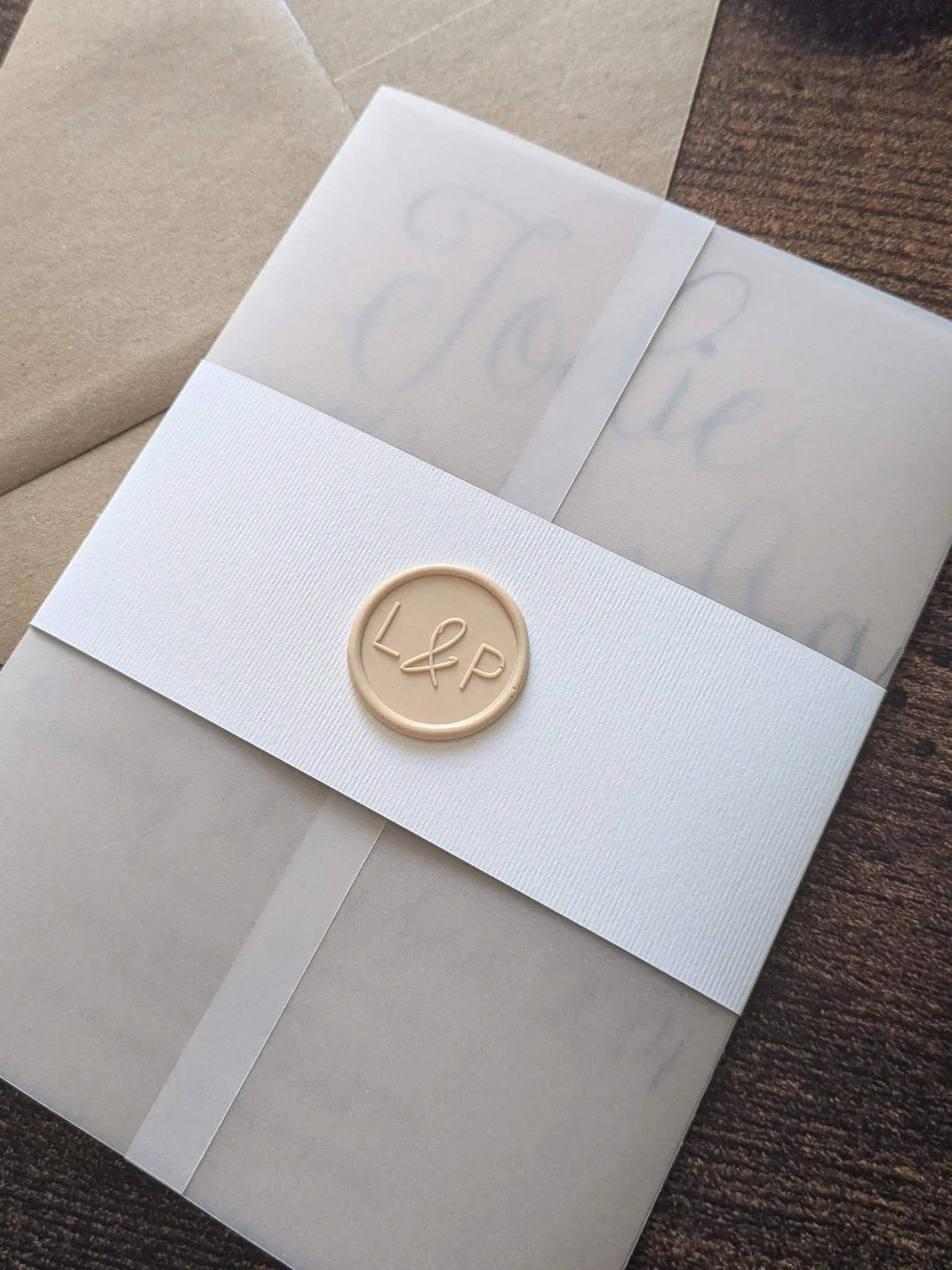
A vellum wrapped invitation suite, finished with a wax seal on a chic white belly band
Real Foiling
Metallic accents, such as gold, silver, or rose gold, can add a touch of luxury to your neutral wedding stationery. These accents catch the light and bring a sense of glamour and sophistication to your invitations. They bring a sense of opulence without being too bold, striking the perfect balance for modern weddings.
Textured Paper
The type of paper you choose for your wedding stationery can also play a crucial role in its overall look and feel. Textured paper adds dimension and tactile interest, making your invitations feel even more luxurious. And with a more subtle and neutral colour palette… this added bit of luxury can be the key to impactful designs.
Ribbon
Delicate satin or silk ribbons, in shades that complement your chosen colour palette, can be softly tied around invitations or added to place cards to create a charming, layered effect. Whether you choose a classic bow or a simple knot, incorporating ribbon is a delightful way to add a personal touch to your wedding day.
Vellum Wraps
Semi-transparent vellum wraps can add an extra layer of subtle luxury to wedding invitations that pairs especially well with a neutral colour palette. It adds depth and character without needing additional colours or patterns.
Wax Seals
The ultimate finishing touch when it comes to wedding invitations. Much like foil printing, wax seals in a chic metallic shade like rose gold, bronze, or even silver can add such a flair to your stationery suite. Or really keep things neutral with a stunning shade of beige to dress everything up even more.
Custom Illustrations
Adding custom illustrations to your wedding stationery is a wonderful way to personalise your invitations and make them truly one-of-a-kind! Line drawn illustrations work especially well as they can be done in soft, neutral tones to complement the overall theme while adding a layer of uniqueness. They make your stationery feel more intimate and connected to your love story, making it all the more special for your guests.
Why Neutrals Can Be More Than Just Neutral!
Neutrals offer such a versatile canvas that allows you to experiment with different elements and styles. They can be elegant, modern, luxurious, and personal- all at the same time.
Neutrals are timeless and can easily adapt to any wedding theme, making them an excellent choice for couples looking to make a lasting impression on their guests.
Explore The Design Shop, where you'll find a curated selection of beige and neutral designs that goes beyond the ordinary. Whether you're looking for bold fonts, elegant lined envelopes, or custom illustrations, I have everything you need to create the perfect stationery suite.
Ready to take your wedding stationery to the next level? Get in touch, and let's start creating something beautiful together. Your wedding deserves nothing less!
And if you're curious about the opposite end of the spectrum, have a read of my posts on maximalist wedding invitations and colour block stationery- because sometimes seeing the boldest designs helps you figure out exactly where your sweet spot is!