Retro Wedding Stationery: Good Vibes, Flower Power, and Zero Bell Bottoms
Okay, hear me out. I know retro can conjure some very specific images… your nan's carpet, brown-and-orange kitchen tiles, the kind of wallpaper that takes three people and a heat gun to remove. But that’s absolutely not what we are talking about here.
The retro wedding trend coming through is something much more exciting: bold florals with a 70s daydream quality, earthy terracottas and burnt oranges sitting next to warm mustards and avocado greens, graphic typography with real personality, and patterns that feel joyful rather than dated.
It’s all the best bits of a brilliant decade, filtered through a modern sensibility. Retro wedding stationery done this way is not your mum's wedding- it’s your wedding, with a really excellent sense of humour about itself.
Retro Wedding Stationery, Hawthorne and Ivory Style
Let me show you what retro looks like when it is done with a contemporary eye.
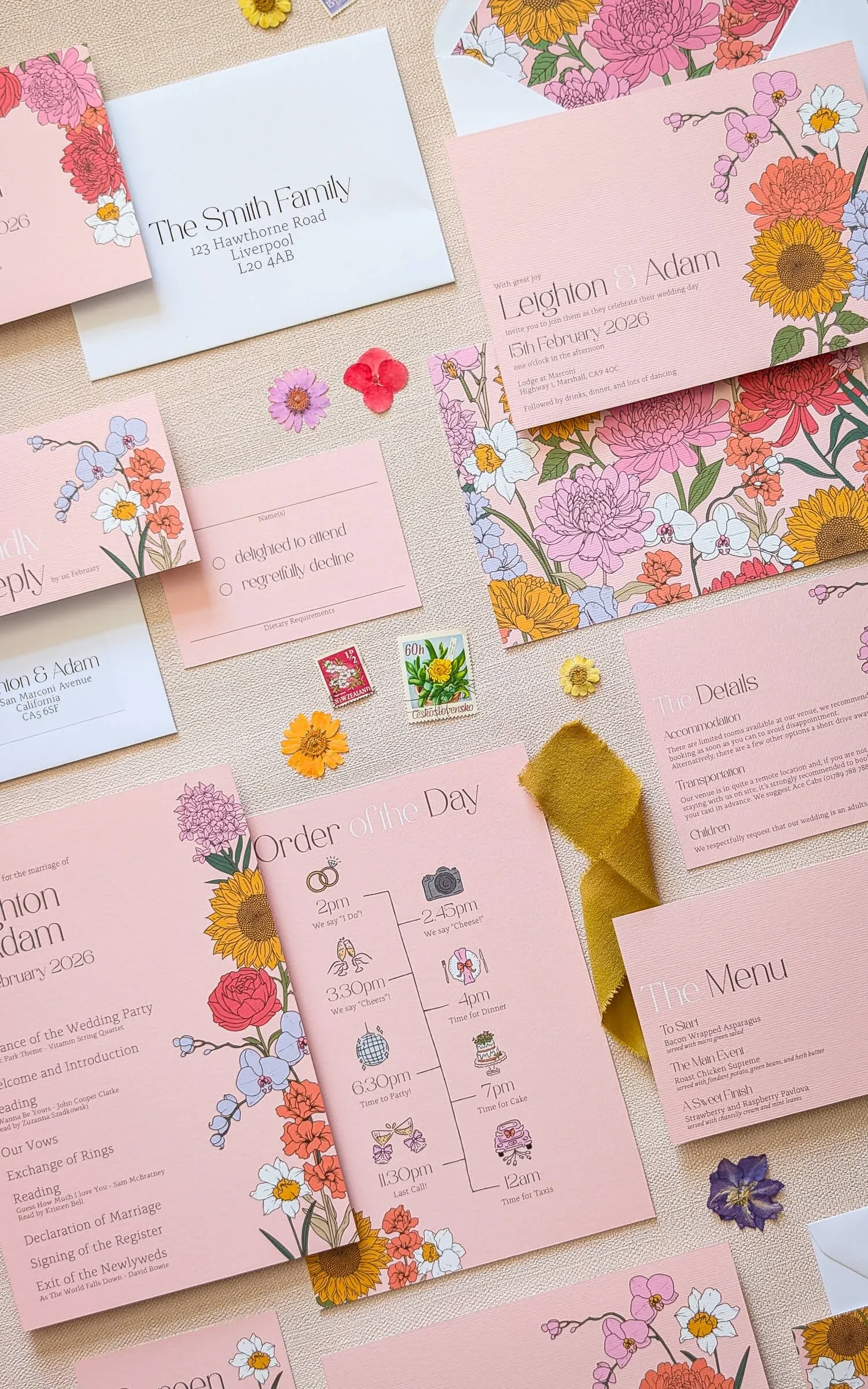
The Retro Floral Collection
This is the one that started the conversation for me- and honestly, I had so much fun making it. Retro Floral is a bold, joyful suite inspired by 70s flower power. Vivid floral motifs in a mix of colours that feels celebratory and a little bit groovy, printed on beautiful fine nettuno art cardstock that has a gorgeous tactile quality.
It’s packed with personality without taking itself too seriously, which I think is exactly the right energy for a wedding. The background colour can be changed to suit your palette, so if you want to dial up the earthy tones or go brighter, we can absolutely do that.
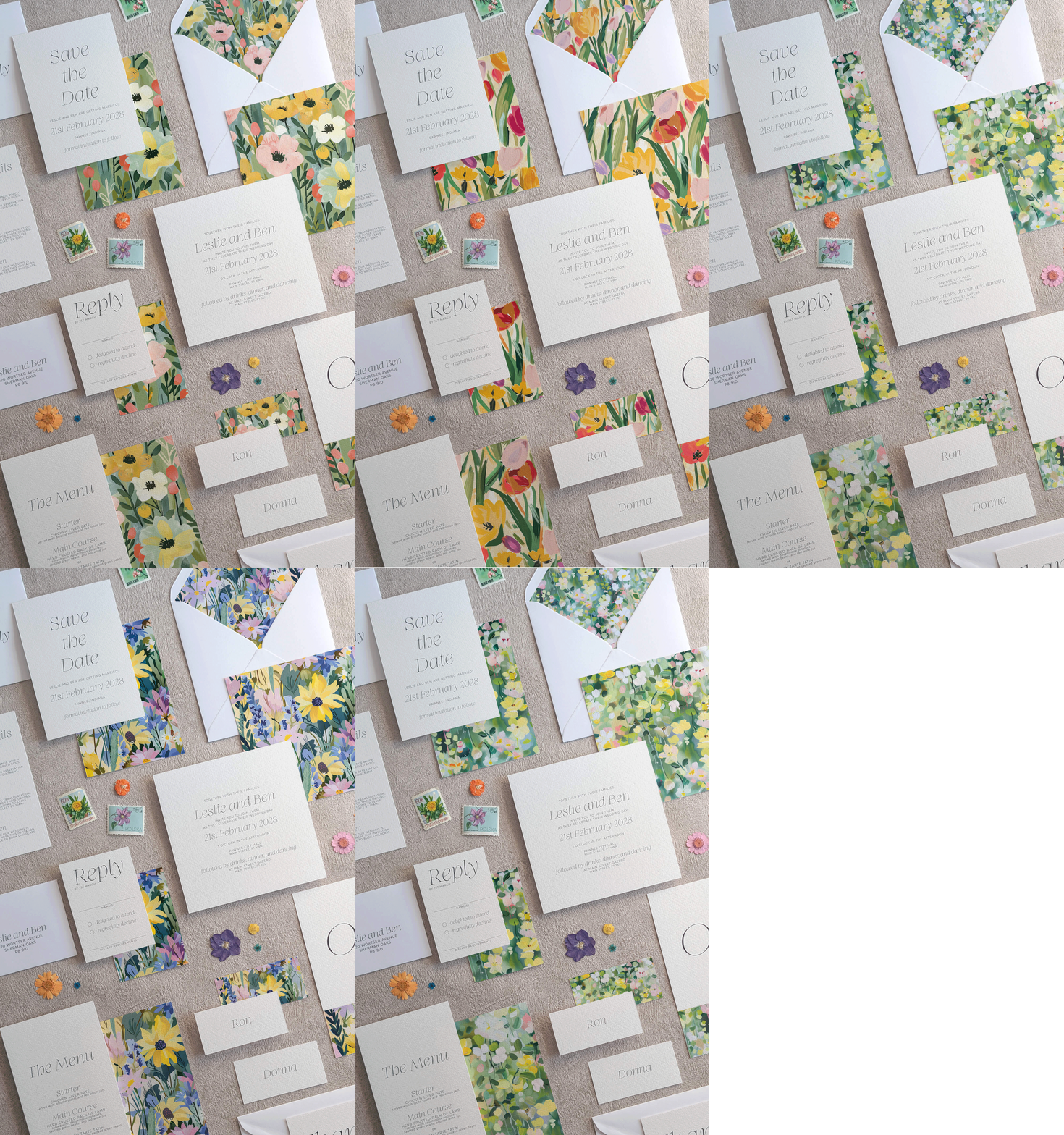
The Studio Floral Collection
My newest design takes the retro pattern idea and runs with it- offering six different patterned backing options so you can choose the one that fits your wedding world best, or mix and match across the suite for a really considered, layered effect.
Pattern is such a central part of the retro aesthetic, it’s what gives it that confident, full-of-life quality, and having six options means there is genuinely something for every kind of retro couple, whatever colour palette has caught your eyes.
Colour Block
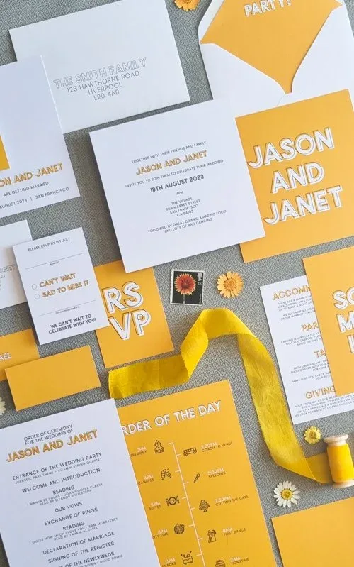
Colour Block is retro from a different angle entirely- this one is all about the typography. Bold offset type, cool graphic phrases, a mustard yellow that is thoroughly and gloriously 70s. This suite lets the words do the talking in the most stylish way possible.
It’s perfect for couples who love the retro aesthetic but would rather channel a design-studio-in-1972 vibe than a floral daydream one. The colour can be switched out entirely, and you can even mix and match between cards to build a full palette across the suite- which is a gorgeously retro thing to do.
Bringing Retro to Your Wedding Day
Once your stationery sets the tone, there are so many brilliant ways to carry the retro thread through to the day itself- and a lot of them are genuinely fun to plan.
On the day stationery and signage is the obvious place to start. Carrying your retro palette and pattern through from invitations into menus, place cards, table names, order of the day signs, and welcome boards creates a visual world that guests step into the moment they arrive. A bold retro welcome sign is something that photographs extremely well and sets the mood before anyone has even sat down.
Retro phone guest books are having a serious moment right now, and they feel perfectly at home in a retro-themed wedding. Guests pick up a vintage phone handset and leave a voice message. It’s nostalgic, it’s interactive, and it results in the most wonderful audio keepsake. Couples are absolutely obsessed with them and I completely see why.
A traditional guest book- especially one with a beautiful retro-inspired cover, or designed to coordinate with your stationery suite - is another lovely way to create something lasting from the day. I have a whole blog post on guest books worth reading if this is on your radar, with lots of ideas for making them feel really special.
Polaroid cameras on the tables are pure retro joy- the format alone does half the work. Guests love them, the photos end up stuck into your guest book or pinned to a board, and there is something so warm and immediate about a Polaroid that digital photos just cannot replicate.
Vintage lawn games, croquet, giant Jenga, hoopla, are a brilliant addition to a retro summer wedding, particularly for the drinks reception. They get guests mingling, they look gorgeous in photos, and they bring exactly the kind of relaxed, playful energy that the retro aesthetic is all about.
Styling details like earthenware vessels for florals, macrame table runners, rattan charger plates, taper candles in amber and mustard, mismatched vintage crockery… all of these lean into the retro world beautifully and the cumulative effect of lots of considered small details is extraordinary.
Finding Your Own Version of Retro
This is the thing about retro as a wedding aesthetic: it genuinely means something different to everyone, and that is one of its great strengths. For some couples it is all about the 70s florals and earthy colour palette. For others it is graphic, bold typography and strong colour blocking.
For others still, it is a nod to a specific era- the Art Deco glamour of the 1930s, the pastel sweetness of the 1950s, the psychedelic brightness of the late 60s.
All of these are retro. All of them can be beautiful. None of them need to look like a costume party.
The key is always in the edit- choosing the elements that feel genuinely exciting to you and leaving behind the ones that feel like a theme rather than a reflection of your personality. And this, honestly, is where bespoke design becomes really valuable.
When we work together on a bespoke suite, we start from your specific vision, the colour palette you are drawn to, the era you are referencing, the overall feeling you want your stationery to create, and build something that captures all of that without ever feeling dated or costume-y.
I can help you figure out exactly what retro means to you and translate it into stationery that feels fresh, considered, and completely your own. Whether that is a subtle retro nod through font choice and colour palette, or a full-on groovy maximalist design moment, it is a conversation I would love to have.
Explore bespoke design and get in touch
Ready to Get Groovy?
Retro done well is one of the most joyful, personality-packed aesthetics a wedding can have. And with the right stationery setting the tone, the whole day can feel like a celebration of everything brilliant about looking back while moving very happily forward.
Here is where to go next:
Good vibes only. Let's make stationery with soul.