The Studio Floral Collection
Wedding stationery with a clean, contemporary feel and a bold floral heart.
This collection is all about that perfect balance. A beautifully minimal front that lets your names and wedding details shine, paired with the most gorgeous painterly floral reverse. And the best bit? You get to choose which one.
With five stunning reverse designs to pick from, each one a vibrant, hand-painted artwork in its own right, this set is just as beautiful from the back as it is from the front. Whether you're drawn to soft meadow blooms, bold sunflowers, painterly tulips, or something in between, there's a pattern here that's made for your wedding.
- save the dates
- wedding invitations (with matching details and RSVP cards)
- additional finishing touches (belly bands, envelope liners, address printing, envelope sealing stickers)
- order of service booklets
- place cards
- menu cards
- table names and numbers
- table plans (large boards, or individual cards)
- welcome signs
- order of the day signs
- personalised wedding guestbooks
- other small signage (i.e. for signature cocktails, cake flavours, remembrance signs, or anything you need!)
- thank you cards
… plus practically anything else you can think of!
- Add a venue illustration
- Add an illustrated map / order of the day timeline
- Change the colours
- Add additional flowers
- Swap the envelope colours
- Add foil
- Add extra flourishes (e.g. ribbon, wax seals)
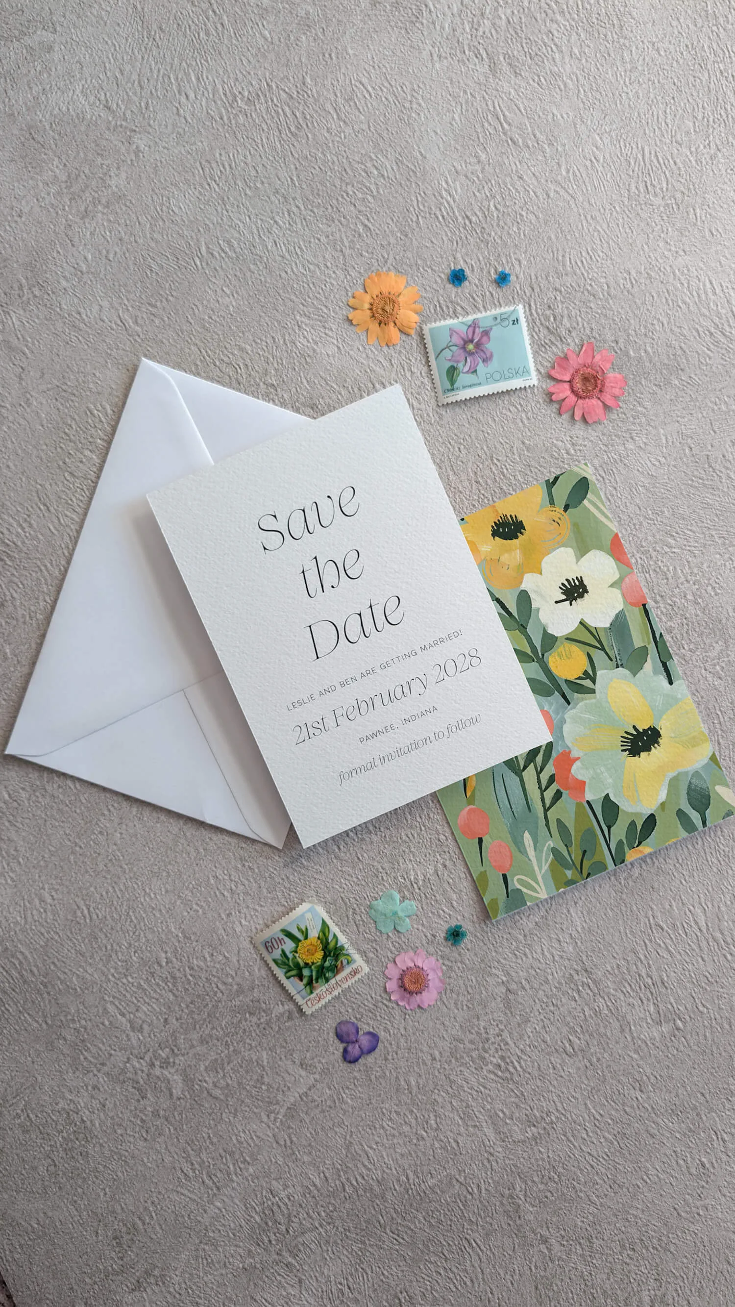
- save the dates
- wedding invitations (with matching details and RSVP cards)
- additional finishing touches (belly bands, envelope liners, address printing, envelope sealing stickers)
- order of service booklets
- place cards
- menu cards
- table names and numbers
- table plans (large boards, or individual cards)
- welcome signs
- order of the day signs
- personalised wedding guestbooks
- other small signage (i.e. for signature cocktails, cake flavours, remembrance signs, or anything you need!)
- thank you cards
… plus practically anything else you can think of!
- Add a venue illustration
- Add an illustrated map / order of the day timeline
- Change the colours
- Add additional flowers
- Swap the envelope colours
- Add foil
- Add extra flourishes (e.g. ribbon, wax seals)
from start to finish…
Save the Dates
Wedding Invitations
On the Day Stationery
Thank You Cards
The Studio Floral collection is all about that perfect balance- a beautifully minimal front that lets your names and wedding details shine, paired with the most gorgeous painterly floral reverse. And the best bit? You get to choose which reverse. It's a clever piece of design that gives you two looks in one suite, and I'm genuinely proud of how it's come together.
This is the collection for couples who love both restraint and abundance- clean typography on one side, lush florals on the other. It works beautifully across every season and venue type, from modern urban warehouses to country house weddings to garden marquees. Couples who appreciate considered design, who want their stationery to feel current rather than trend-led, and who like the idea of a slightly more interactive piece of design (do you put the floral side up or the typography side up?) tend to fall hard for this one.
The florals on the reverse are painted in a loose, generous style- roses, peonies, tulips, garden blooms, and trailing foliage in a palette that flexes across several different colour stories depending on your preference. The typography side is clean, modern, and beautifully spaced. The contrast between the two sides is what gives the whole suite its character- it's quietly clever without ever feeling gimmicky. The design pairs effortlessly with brushed gold, ivory linen, mixed florals, and any styling that values both restraint and warmth.
The full suite is available: save the dates, wedding invitations (with matching details and RSVP cards), the complete on the day stationery range (order of service booklets, place cards, menu cards, table numbers, table plans, welcome signs, signage), and thank you cards. Belly bands, envelope liners, address printing, and sealing stickers are all available as finishing touches. The painted florals can be adjusted to match your specific wedding flowers- pinks, peaches, lilacs, soft yellows- and gold foil details on the typography side look particularly beautiful. A venue illustration sits well on either side.
Order a printed sample to see both sides in person- it really shows off the cleverness of the design. If you love the dual-sided spirit but want a suite built around your specific florals and venue, this collection is a brilliant starting point for a bespoke commission.