Wedding Invitations with Bold Patterns: How to Embrace the More-is-More Moment
Pattern is having its wedding era- and honestly, it's about time. This kind of style is right up my street (if you hadn’t already guessed from so many of my designs!!).
Wedding invitations with bold patterns are just one part of a much bigger shift happening across the wedding world right now, where couples are confidently stepping away from the safe, the neutral, and the understated, and leaning hard into the joy of visual maximalism.
We're talking stripey parasols lined up along a ceremony aisle, floral tablecloths that are sophisticated rather than naff (think linen, not laminate), patterned china that makes every table setting feel considered and intentional, and accessories that have something to say.
Pattern can be woven through the whole aesthetic- and your stationery is the perfect place to start the conversation.
How to Pull Off Pattern at Your Wedding (Without It Tipping Into Chaos)
This is the question, isn't it? Because there's a version of patterned weddings that feels curated and gorgeous and completely you, and then there's a version that feels like a lot of different people made a lot of different decisions in the same room. The difference is almost always about intention.
A few principles I'd offer:
Choose a colour story and stick to it. Pattern becomes overwhelming when there are too many competing palettes at play. Pick two or three colours that run through every patterned element, whether it's the stripes on your parasols, the floral on your tablecloths, or the motif on your stationery, and suddenly everything feels cohesive rather than chaotic.
Let some things breathe. The trick with maximalism is knowing what to give the spotlight and what to let sit quietly. If your stationery is bold and patterned, a plain linen napkin can be a beautiful counterpoint. If your tablescape is busy, simple white place cards let it settle.
Carry a thread. The most beautiful patterned weddings have a visual motif that recurs - a specific floral, a stripe direction, a geometric detail- that ties everything together like a through-line in a great story. More on this below!
And the best possible place to establish all of this? Your invitations. They're the first thing your guests encounter- the opening scene, the first impression, the thing that tells them this wedding is going to be something. Get the pattern right there, and everything else has something to follow.
Patterned Wedding Stationery: Where to Begin
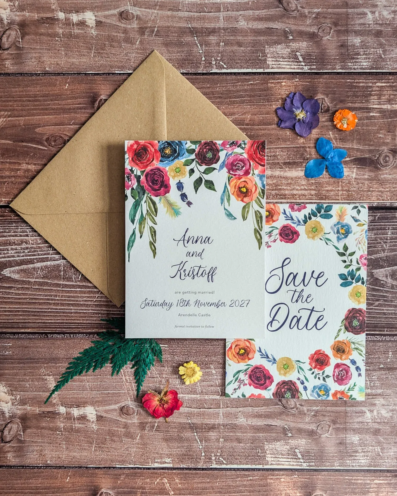
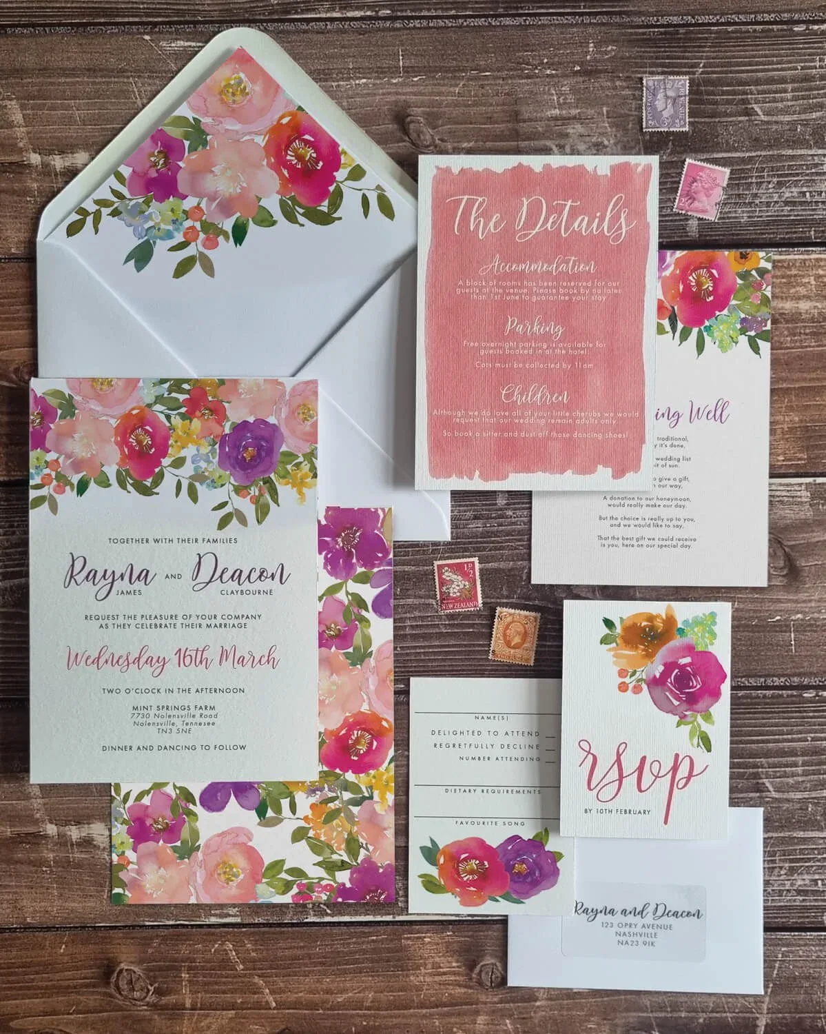
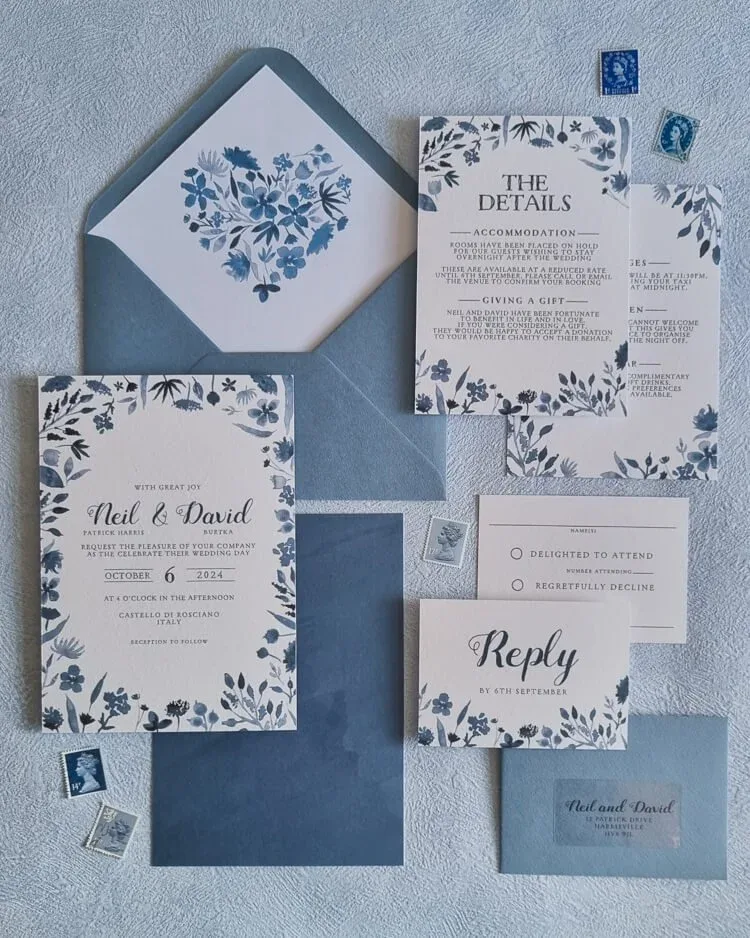
I've been having so much fun exploring patterns in stationery lately, and my new design with six different backing options is a real celebration of exactly this. Six distinct patterns, all designed to work within the same suite, so you can choose the one that speaks to you or - and this is where it gets really exciting- mix them across different elements. Different backing for the invitation versus the RSVP versus the information card? Yes, absolutely, that's a look.
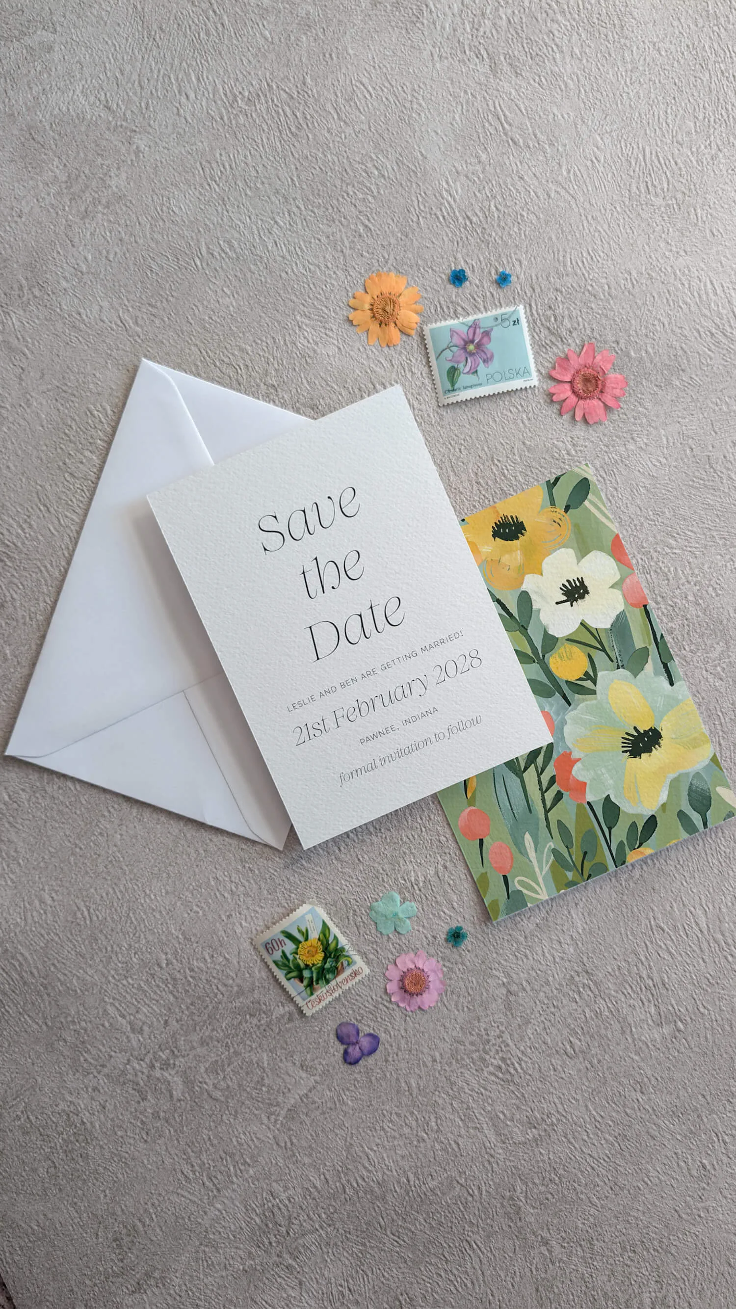
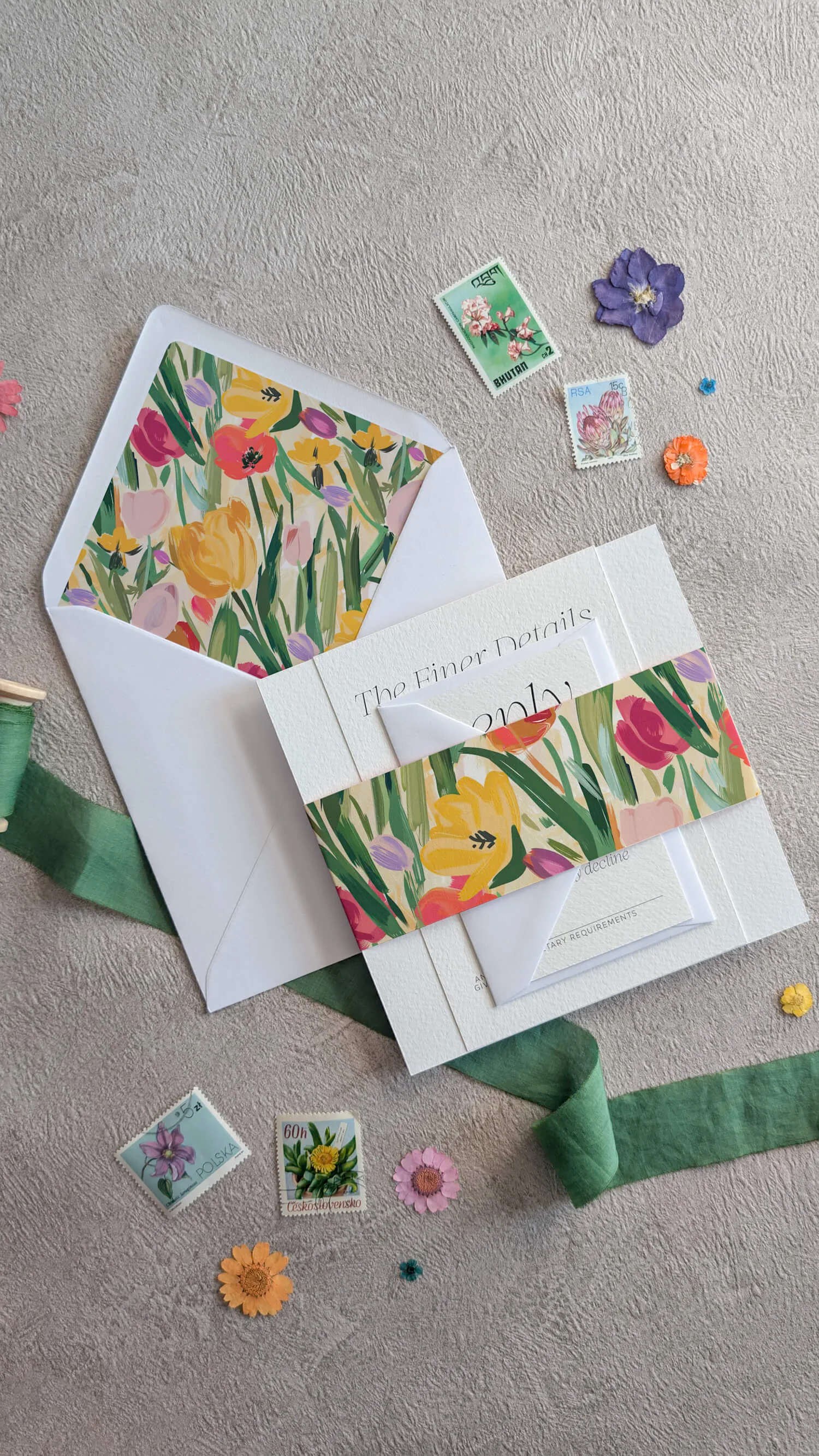
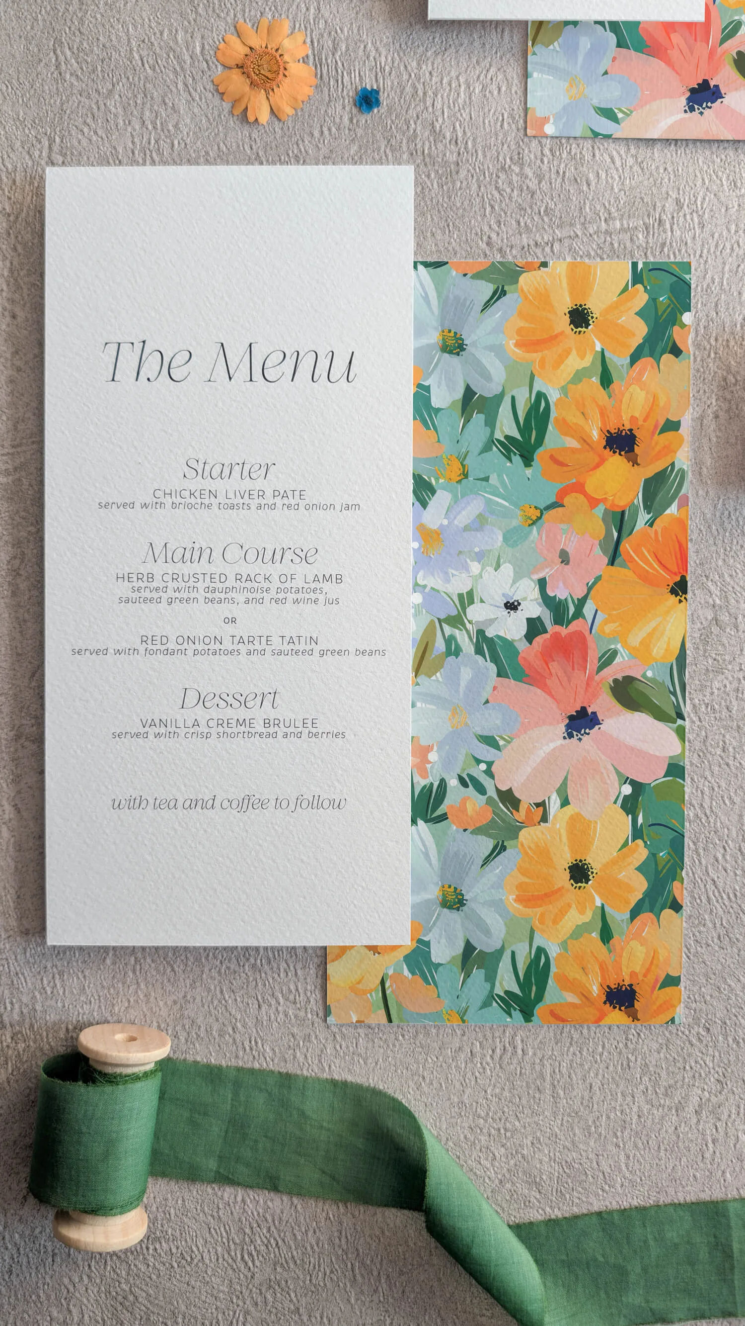
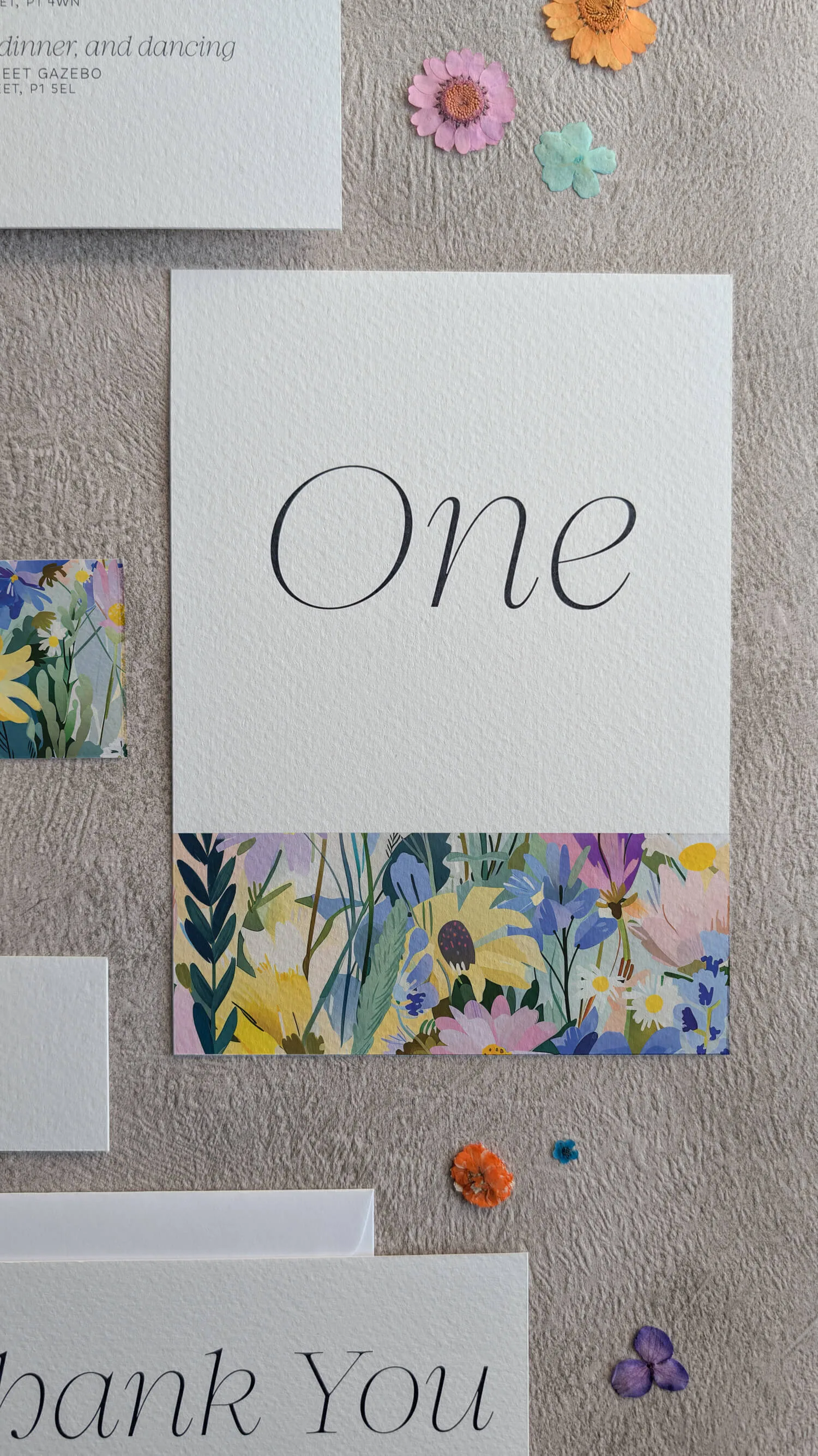
Beyond that design, there are so many ways to bring pattern into a stationery suite:
Pattern Inspiration: Find Your Print Personality
Not sure which pattern direction is yours? Here are some of my favourites - and a little nudge for each:
Floral pattern - the one I'll always advocate for, because florals are endlessly versatile (and my personal favourite). A bold, painterly floral pattern is completely different from a delicate ditsy print, which is completely different again from a graphic, geometric floral. There's a floral pattern for every aesthetic- lush and maximalist, fresh and modern, wild and botanical. If you love flowers at your wedding (and most people do!), a floral pattern in your stationery creates a beautiful visual connection to your florals on the day.
Stripes - underrated in wedding stationery, but so effective. A bold stripe - especially in an unexpected colour combination - has a graphic, confident quality that feels modern and a little bit editorial. Particularly beautiful if your venue or styling has any carnival, garden party, or coastal references.
Botanicals and leaf prints - for the couple who wants pattern but wants it to feel lush and organic rather than graphic. Overlapping leaves, trailing vines, pressed-botanical-style designs - these have a richness that rewards close looking and work beautifully in deep jewel tones or soft, earthy palettes.
Geometric and abstract prints - for the couple with a more contemporary eye. A bold geometric pattern in stationery can feel genuinely artistic - especially when the colour palette is well-considered. Think art deco, think modern gallery, think wedding-as-design-statement.
Marbled and painterly patterns - swirling, movement-filled, deeply luxurious. Marble especially has that quality of feeling both ancient and completely of-the-moment, and a marbled pattern on an invitation envelope liner or backing card is properly show-stopping.
One more thought: if you're already using a specific pattern elsewhere in your wedding, maybe a fabric you've fallen in love with for table runners, or a tile design at your venue, I would love to talk to you about a bespoke suite that incorporates it.
Matching a stationery motif to a pattern used elsewhere in your day is one of those details that most guests won't consciously notice but everyone will feel. It's the kind of thing that makes a wedding feel like it was designed, not assembled.
Enquire about bespoke design →
Ready to Make a Statement?
Pattern is joyful, and your wedding stationery absolutely deserves to be too. Whether you're drawn to one of my existing patterned designs, you want to explore how to bring pattern through a whole suite, or you're imagining something entirely bespoke- I'd love to help you create invitations that genuinely excite the people who receive them.
Here's where to go next:
Your invitations are the first thing your guests will hold in their hands and feel excited about. Make them something worth getting excited about.