Something Blue, But Make It Stunning: Icy Blue Wedding Stationery for 2026 and Beyond
The short answer: Icy blue is having a moment for 2026, and Hawthorne and Ivory's brand new Frosted Garden Collection is the answer- delicate watercolour botanicals in ice blue, dusty periwinkle and silver-white, perfect for winter weddings or soft pastel spring celebrations. Beyond the icy end, blue suits practically every wedding style: Porcelain for classic walled-garden weddings, Dutch Masters for moody autumn manor houses, Shoreline for coastal celebrations.
If this is your first visit, I'm Becky and Hawthorne and Ivory is my wedding stationery design studio. I create colourful, fun-loving save the dates, invitations, on the day pieces (menus, place cards, signage), guest books and thank you cards for UK couples, either through The Design Shop or fully bespoke. Onto the new design…
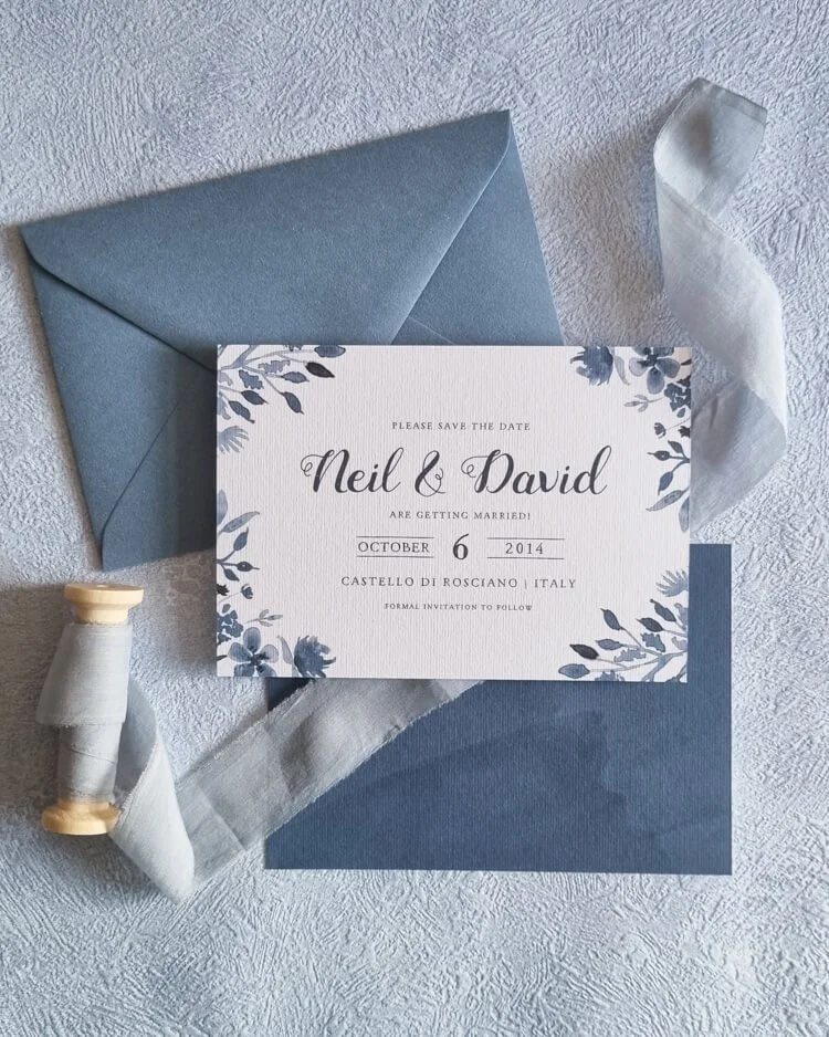
Blue has always been one of those wedding colours that just works- and in 2026, it's having a genuine moment. Icy blue wedding stationery in particular is capturing a lot of hearts right now, and with very good reason: there's something about those cool, frost-kissed tones that feels both timelessly romantic and completely fresh.
Whether you're planning a winter wedding that leans into every frosty, candlelit detail, or a spring celebration where soft pastels set the scene, blue has a shade with your name on it. And the timing feels right to talk about it… because I've just launched a brand new design in this exact colour world that I'm really rather excited about.
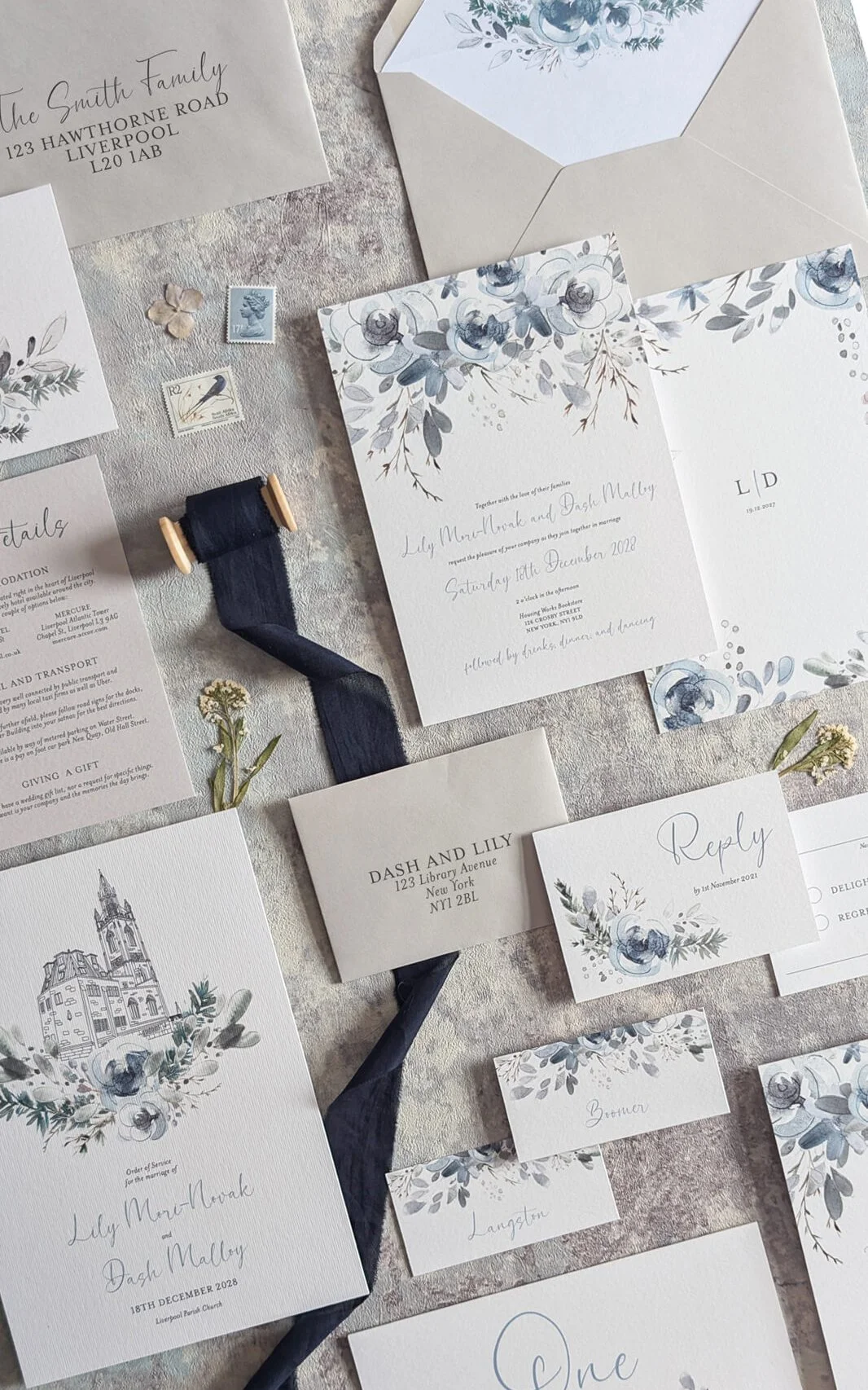
Introducing: The Frosted Garden Collection
I created this design because I kept noticing a gap. Couples would come to me with colour palettes built around those cool, barely-there blues, ice, periwinkle, silver-white, and I didn't quite have the right design to offer them. The Frosted Garden Collection is my answer to that.
The design was born from a winter styled shoot at one of Liverpool's most iconic and beautiful venues- the Royal Liver Building. That chic, blank canvas of a space, all cool elegance and clean architectural lines, was the most extraordinary backdrop, and it set the tone for everything that followed. Shooting there gave me the clearest possible vision of exactly what this collection needed to be.
The design features delicate botanical watercolour illustrations in a palette that drifts between ice blue, dusty periwinkle, and the softest silver-white. Florals that feel like they've been touched by frost, like they're blooming in the very first light of a February morning. Most of my other floral stationery designs lean warm and summery, so this palette really stands out. It feels refined, romantic, and a little otherworldly.
For a winter wedding, picture it paired with white anemones, frosted eucalyptus, and candlelight catching silver details on the tables. For a spring celebration, it slots effortlessly into a soft pastel colour story - especially beautiful if your wedding party are in dusty blue, or your florals are drifting towards lilac and cream. If cool-toned greenery, white or blush blooms, and silver accents feature anywhere in your vision, this design was made for you.
Blue Is Just a Gorgeous Colour (Full Stop)
Beyond the icy end of the spectrum, I want to make the case for blue in all its many wonderful shades- because it's going to be everywhere in 2026 and beyond, and rightly so. From deep sapphire and rich cobalt to soft cornflower and the palest sky, blue shifts its personality so completely depending on the shade and the setting.
It can be dramatic or delicate, traditional or wildly romantic. And of course, there's the lovely nod to "something blue". Choosing blue wedding stationery feels meaningful without being literal about it, which I always think is the best kind of symbolism.
Here's how I'd pair some of my favourite designs with different wedding styles, because sometimes the best way to fall in love with a design is to picture it in context.
Blue Pairings: Find Your Match
Porcelain + A Classic Venue with a Romantic Twist The Porcelain Collection already has that beautiful blue-and-white delicacy- heirloom china, timeless elegance, a little whisper of the antique. Leaning into blue makes the design feel even more intentional. I'd pair this with a couple who love tradition but want a touch of whimsy: a walled garden, a stately home, the kind of wedding that feels like it could have happened in any era.
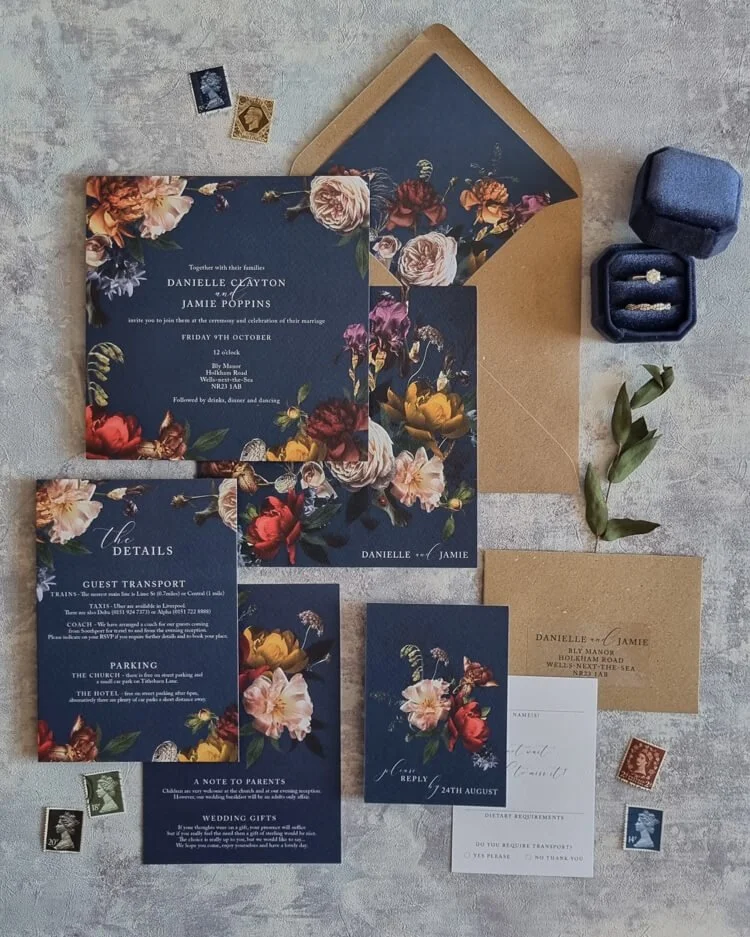
Dutch Masters + An Autumn Country House Wedding The Dutch Masters Collection, with its moody, jewel-toned florals, takes on something especially magical when blue enters the palette. Deep sapphire alongside burnished golds and russet, a 17th century still life come to life. This is the one for an October manor house wedding: log fires, dahlias tumbling across long tables, and guests who arrive in the golden hour and don't want to leave.
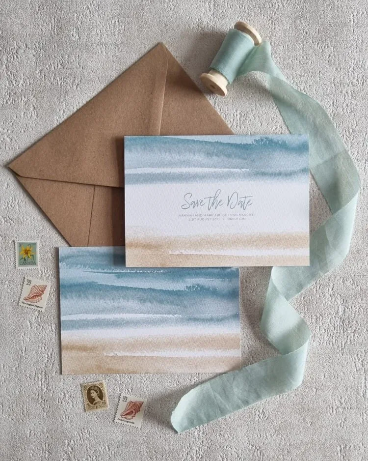
Shoreline + A Coastal or Destination Wedding Shoreline and blue were simply made for each other- this is almost cheating! Azure, turquoise, the particular blue of sea glass- these tones evoke salt air, golden light, and the sound of waves. Perfect for a Devon beach wedding, a harbourside celebration, or a destination day in Greece where the Aegean is visible just through the venue doors.
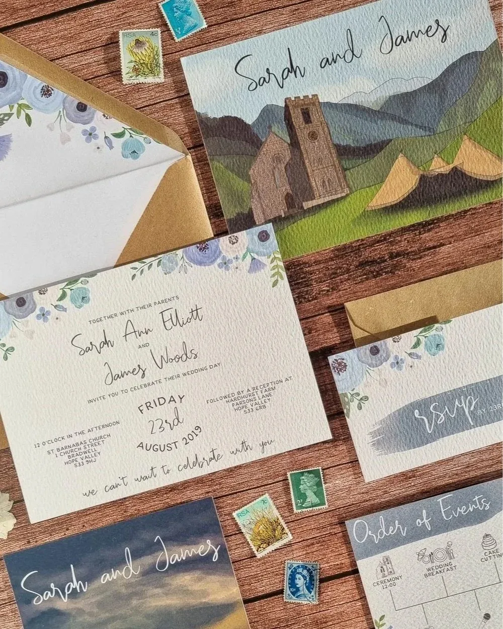
Bespoke Blue - Real Wedding Inspiration: Sarah & James, Peak District This suite is a gorgeous example of what blue can do in a bespoke design. Whimsical anemones and charming botanical details in dusky periwinkle run through the invitation, tying into the broader blue colour story. With illustrated watercolour scenes of the Hope Valley church and a golden-hour landscape of mountains and tipis that feel like tiny works of art.
The blue palette weaves everything together beautifully- from the florals on the invitation to the moody, atmospheric skies in the illustrations. It's a brilliant example of how a colour can carry an entire suite.
Find out more about bespoke design
And one more thing - almost any design in the shop can be interpreted in a blue palette as part of the semi-custom process. Dutch Masters, Porcelain, and Shoreline all lend themselves to blue variations beautifully, and I love adapting palettes to match a couple's specific vision. Just drop me a message and let's have a conversation about it.
Frequently Asked Questions About Blue Wedding Stationery
Can I have an icy blue colour palette at a summer wedding? Absolutely. And it can look incredible! Cool, icy blues create a refreshing contrast to summer warmth- think of them as the visual equivalent of a cold drink on a hot day. They look especially beautiful for an evening summer wedding that feels gloriously cool and romantic.
What colours look good with blue at a wedding? So many!! This is genuinely one of the most versatile wedding colours to work with. Some of my favourite combinations: blue with white and gold for something classic and luxurious; blue with blush and sage for soft, romantic energy; blue with burgundy and terracotta for an unexpected but gorgeous autumn palette; blue with navy and silver for drama; and blue with warm cream and greenery for something fresh and organic. Blue plays beautifully with both warm and cool tones, which means you have a lot of creative freedom.
Is blue wedding stationery formal enough for a traditional wedding? Completely, and in fact, deeper blues like navy and sapphire have a natural elegance that suits formal settings beautifully. For a black-tie wedding, I'd look at deep blue paired with classic serif typography and clean layouts. For something a little more relaxed, lighter blues with organic florals feel effortlessly elegant without being stiff. There's a shade of blue for every kind of wedding- I promise.
Ready to Find Your Very Own Shade of Blue?
Whether you're already in love with my new Icy Blue Floral design, drawn to the painterly richness of Dutch Masters, or you're dreaming of a bespoke suite where every detail is matched to your exact palette… there's a version of blue wedding stationery that's absolutely perfect for you, and I'd love to help you find it.
Here's where to go next:
*Browse the blues in Design Shop* - including Frosted Garden, Porcelain, Shoreline, Dutch Masters, and more blue options…
*Explore Bespoke Design* - for a suite that's entirely, perfectly yours
*Read: Maximalist Wedding Invitations* - if you love the idea of going bold with colour
*Read: Florals in Wedding Stationery* - a deeper dive into botanical design and why it works so well
*Read: 2026 Wedding Stationery Trends* - see what else is trending this year
*Take the Quiz* - answer a few quick questions and get pointed straight to your perfect design
Your stationery should feel like the beginning of something beautiful- and if that beginning is cool, frosty, and blue? I think we're going to get along wonderfully.