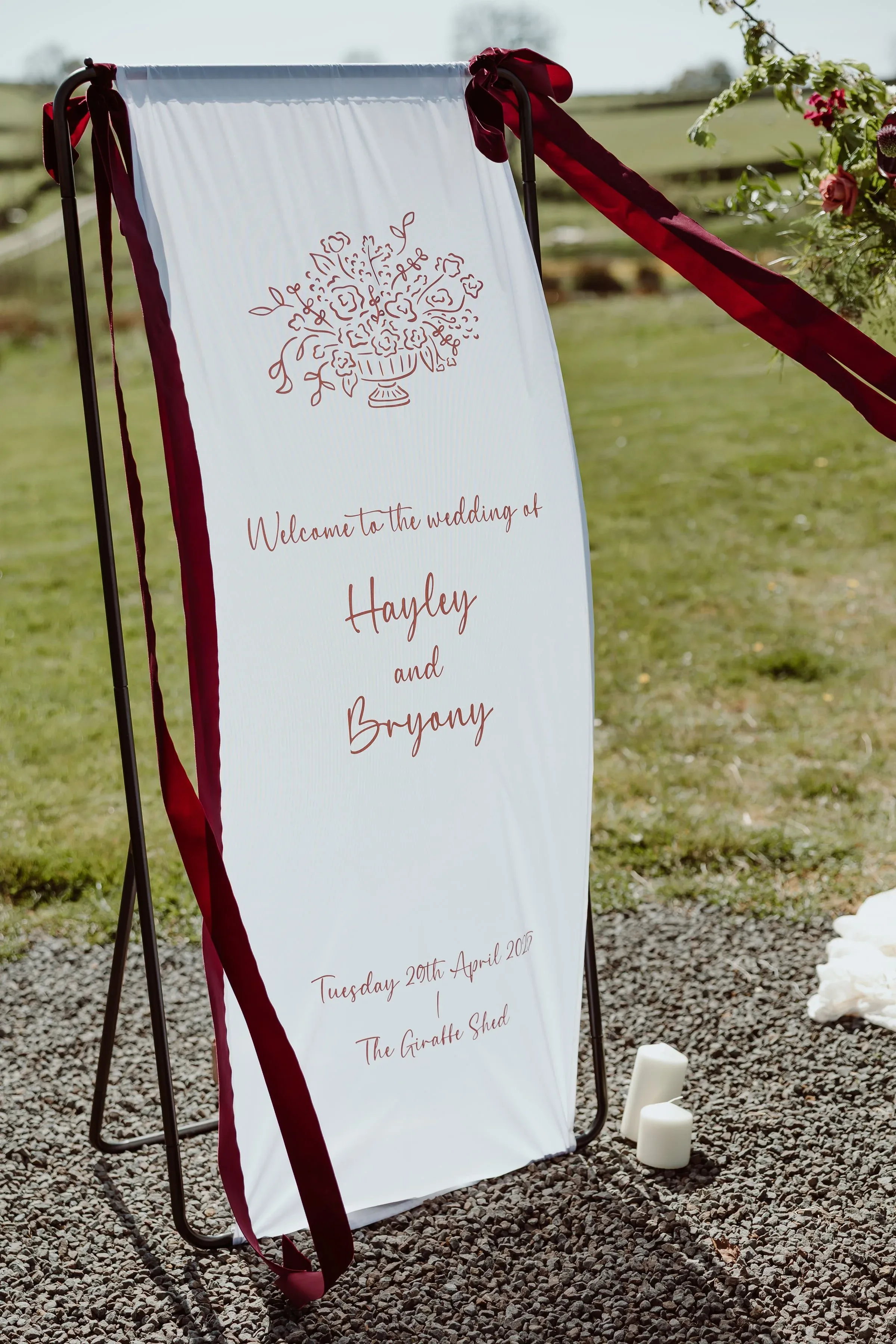
There’s something magical about a fabric sign dancing gently in the breeze, but are they right for your day? I weigh up fabric against traditional hard signage, covering the practical bits that matter: placement and hanging, weather (soggy fabric is nobody’s friend), and why fabric packs brilliantly for destination weddings. You’ll find lots of lovely ways to use them, plus a clear at-a-glance guide to help you decide between the two.
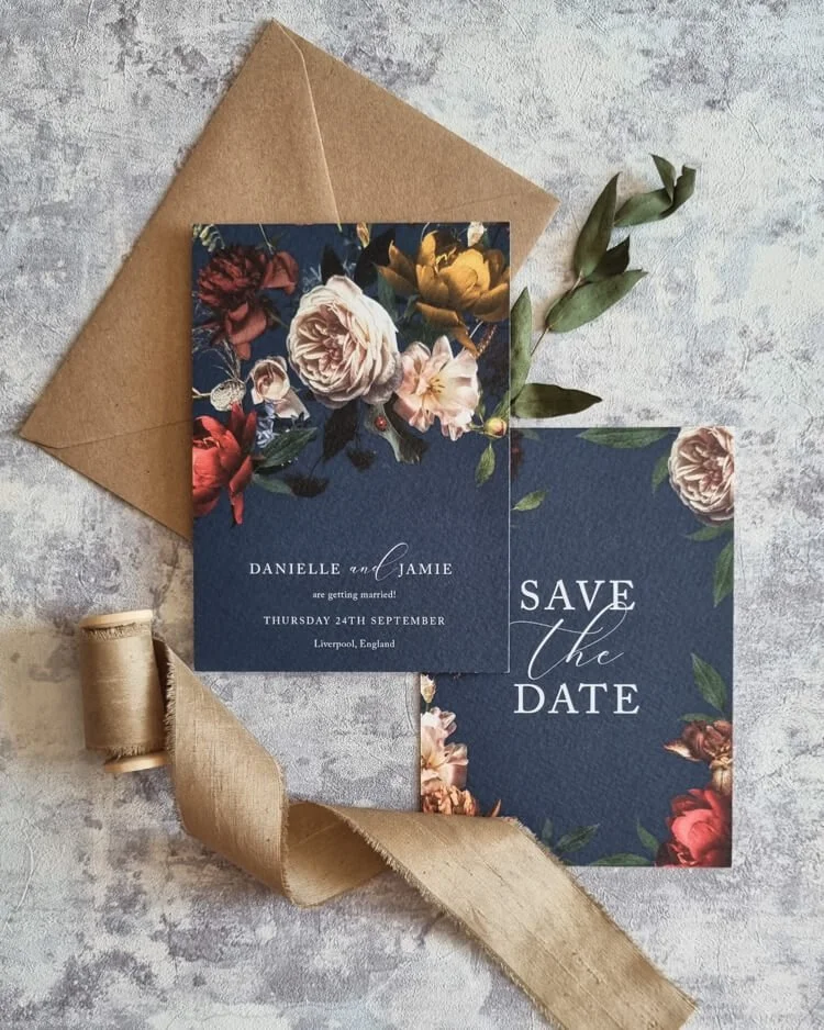
Maximalism is firmly my happy place, and this post makes the case for going big, bold and beautifully over the top. I explain what maximalist really means (thoughtfully abundant, never chaotic), and the elements that make it sing: rich colour, layered design, mixed typography, foiling and wax seals. There are six Design Shop collections to explore, from jewel-toned Dutch Masters to deep Marsala Wine, plus answers to your most common questions.
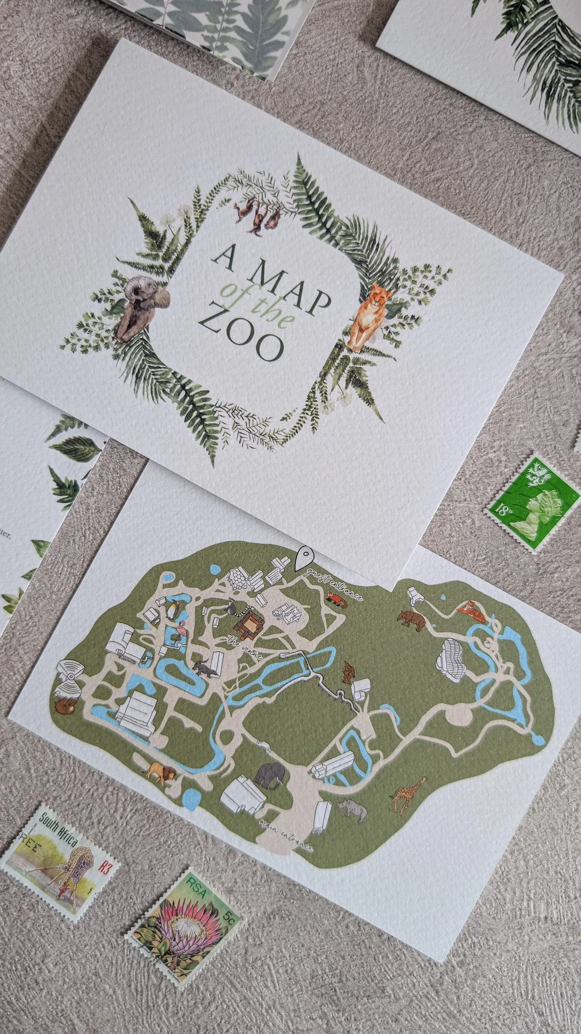
If your venue is the star of your wedding, put it on your save the dates. I share why a glasshouse, city landmark, historic estate or quirky spot deserves the spotlight, then walk through creative ways to capture it: custom venue illustrations, hand-drawn maps, signature architectural details, and seasonal natural elements. You’ll also see why bespoke design works best for one-of-a-kind venues, and when to send your save the dates.
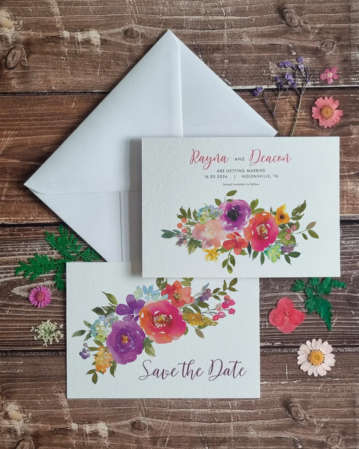
Not all garden weddings look the same, so your stationery shouldn’t either. Whether you’re picturing a cottage garden, a wildflower meadow, a tropical glasshouse or a structured botanical space, I’ll help you match it. I share five collections to inspire you, from Bright Summer Floral to Tropical Palms and Lavender Petals, plus when to send your invitations and how to carry your garden story through every piece, right down to the welcome sign.
Wondering what’s next for 2026? I’m sharing the stationery trends I’m genuinely excited about, from earthy sunset palettes and sustainable local celebrations to striking single-colour designs and bold maximalist colour. We’ll also explore gatefold invitations, layered luxury, illustrative storytelling, and treating your suite as one cohesive experience from save the dates to thank yous. Think of these as creative starting points, not rules, and pick the threads that feel authentically you.
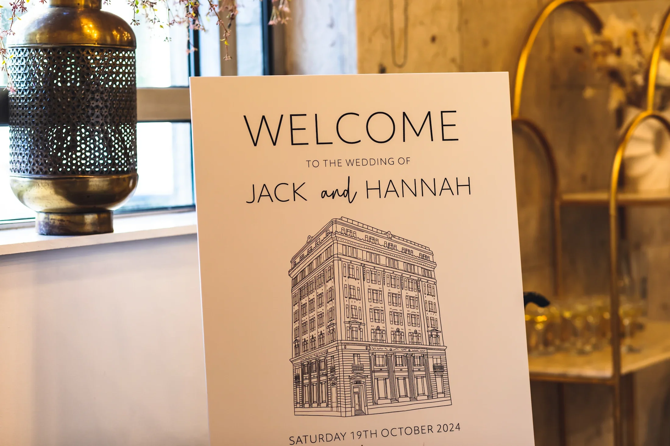
Step inside Hannah and Jack’s bespoke Liverpool wedding stationery, built around two iconic venues: the Royal Liver Building and Oh Me Oh My. I share how we layered autumnal toffee, peach and burgundy florals onto a Minimal Monochrome base, and created a full set of illustrated table names nodding to their dogs, favourite Lark Lane wine bar and even Lord of the Rings. Plus my favourite Liverpool venues to design for.
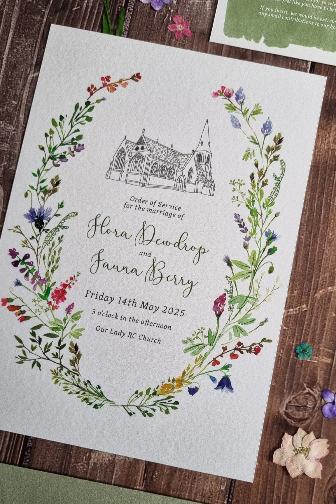
Everything you need to know about your wedding order of service, covering church, civil and celebrant-led ceremonies and what each one needs. I share lovely ways to personalise yours, from venue illustrations and pet portraits to love-story timelines, plus practical advice on length, format and pages. There’s brilliant guest advice from two celebrants too, with clever ideas for putting that blank back page to work. A proper keepsake, not just a programme.
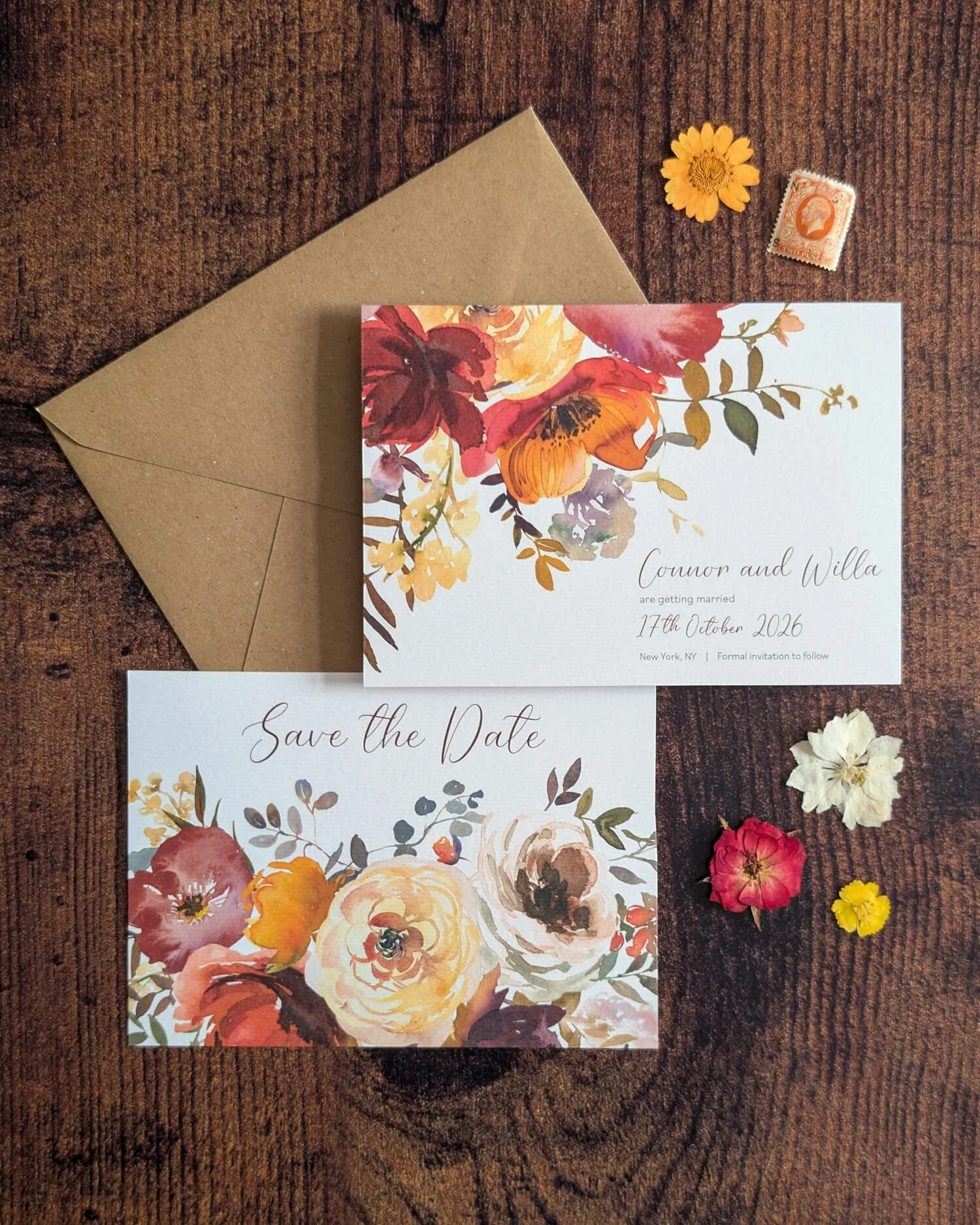
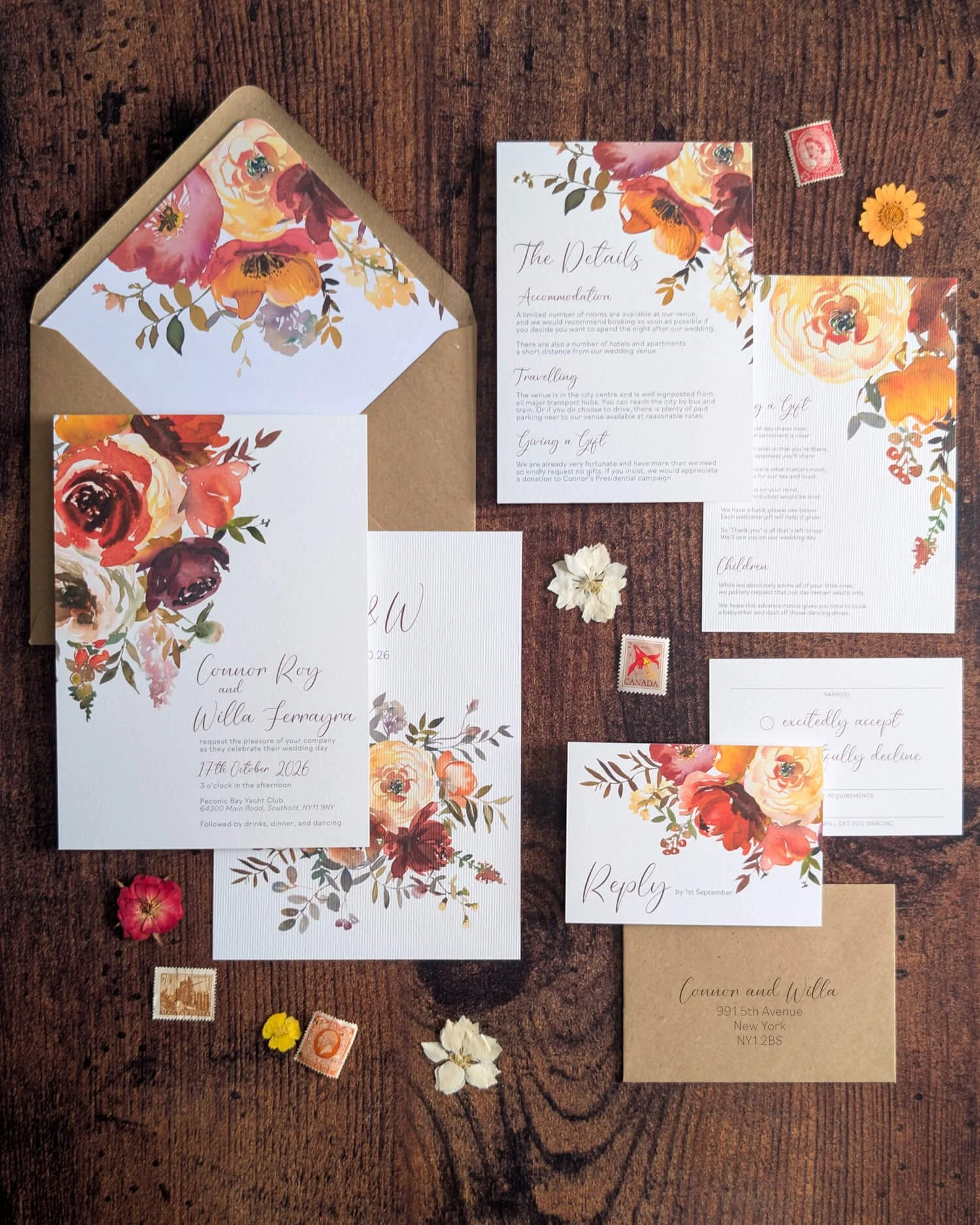
Autumn stationery doesn’t have to mean brown leaves and burlap. As an autumn bride myself, I’m walking you through six collections that capture the season differently, from romantic Sunset Garland and cascading Autumn Floral to moody Dutch Masters, luxurious Marsala Wine and bold Colour Block typography. I’ve also got clever palette swaps, ideas for breaking the seasonal rules entirely, and tips for doing classic autumn brilliantly if that’s your thing.